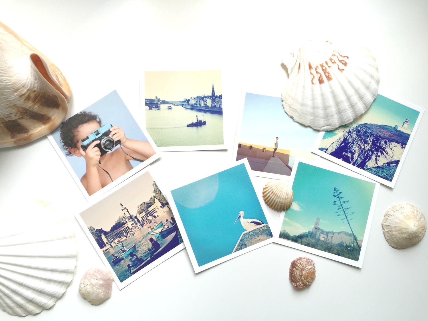
The square format has acquired a rabid fame since the incursion of some social networks, especially Instagram. So much so that there may be those who think that it is a new phenomenon, that it has come from the hand of the smartphone. Nothing could be further from the truth, this format has existed for many years and new technologies have only made it popular and put it on the podium of fame. By the way, if you are attracted to mobile photography, do not miss the mega guide with tips, tricks and much more that we have prepared for you.
I have to confess, although it is not exactly a secret, that I am a fan of this format. I love it. When I shoot with an SLR, not so much, but when I do it with my mobile it's rare that I don't shoot using the 1:1 ratio. And if I don't do it at the moment, when editing, if the image allows it, I end up cropping it. I don't know if it's a matter of nostalgia or what, but now that I'm spending a few days at my mother's house, showing my daughter my childhood photos, I realize that all my childhood memories are encapsulated in a square. This may be the reason for my fondness for the square. Or maybe because I have developed a large part of my photographic eye viewing square photographs.
The question is, does an image in square format compose the same as another in standard format? Well yes and no. They have some similarities but also differences. There are certain scenes, motifs or compositional techniques that look very good in 1:1 format and not so much in the standard format and vice versa. That is why today I am going to dedicate the article to offer you some tips to compose your photo within a square. You stay?
1. CENTER IN SQUARE FORMAT… YES!
In square compositions, centering the subject (or object) is something that works very well. In the panoramic format, you have to find a balance that is not so necessary in the square, since it is already balanced. You can even place the horizon in the middle without fear because it looks good!
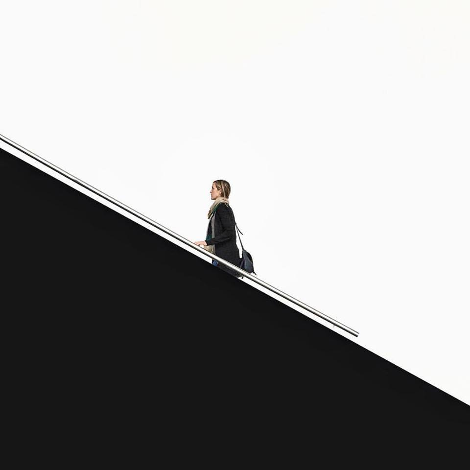
2. INCLUDE LINES
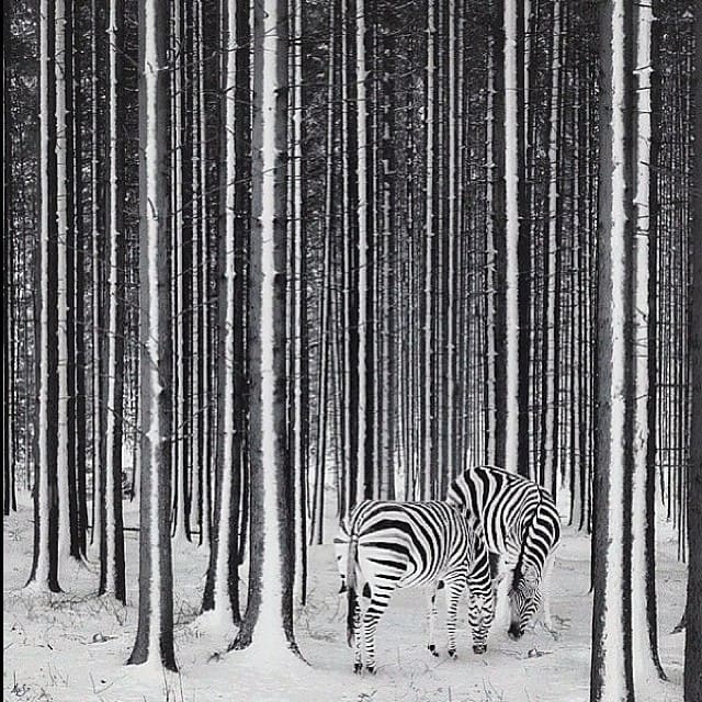
It is true that to photograph landscapes the square format is not the most suitable or the most flattering, however, if there are roads, rivers or any other element that forms a line (straight or curved) in the scene, try including it in the frame , you will see that in this case the result is very different and worth it.
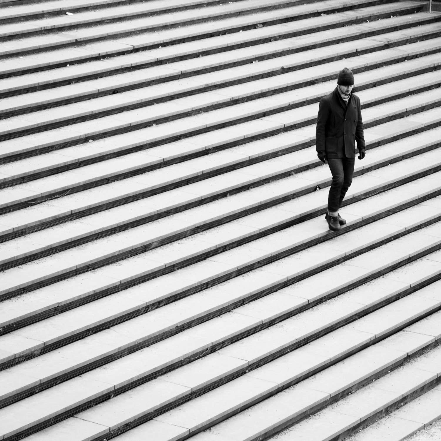
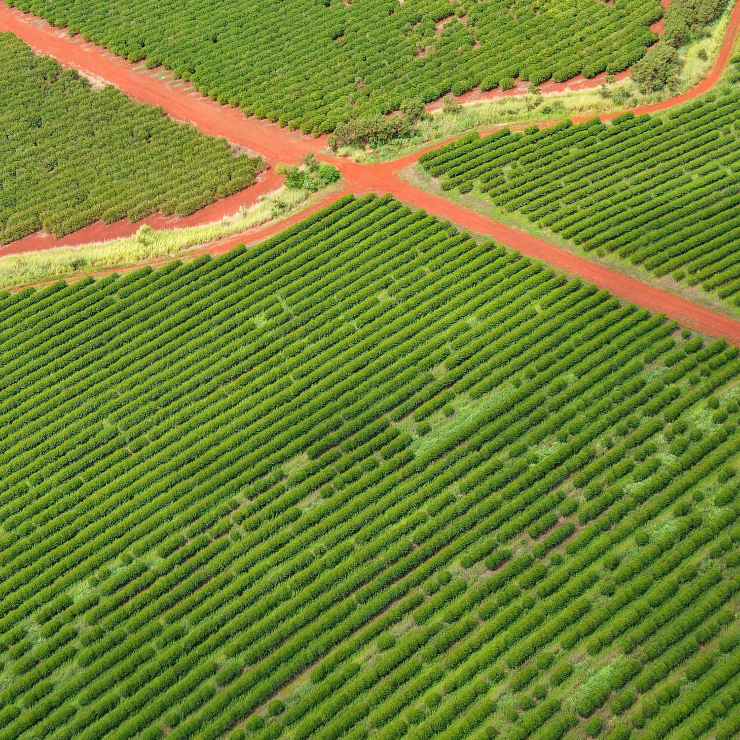
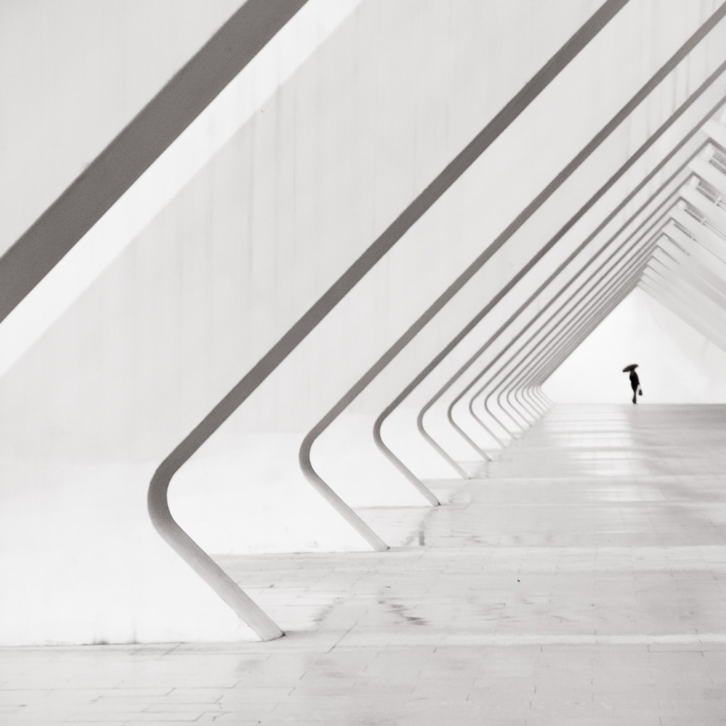
Including lines in the square format is always a success, be they straight, curved, buildings or paths, obvious or suggested. Here are some examples.

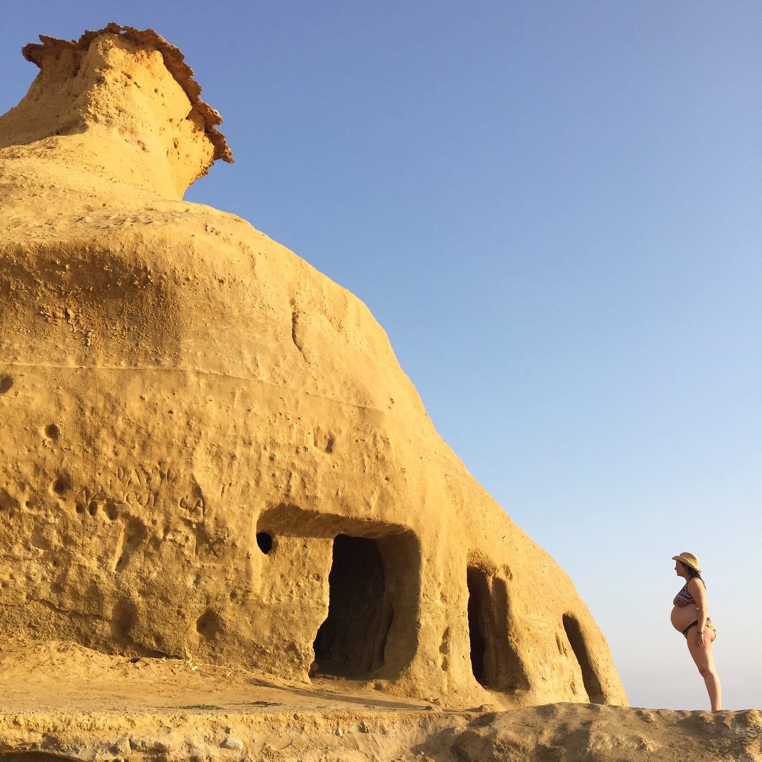
3. MOTIF TO THE CORNER
Another option that is very good is to place the motif in a corner, or on an edge, also cut, that is, it fills the space of the edge completely.

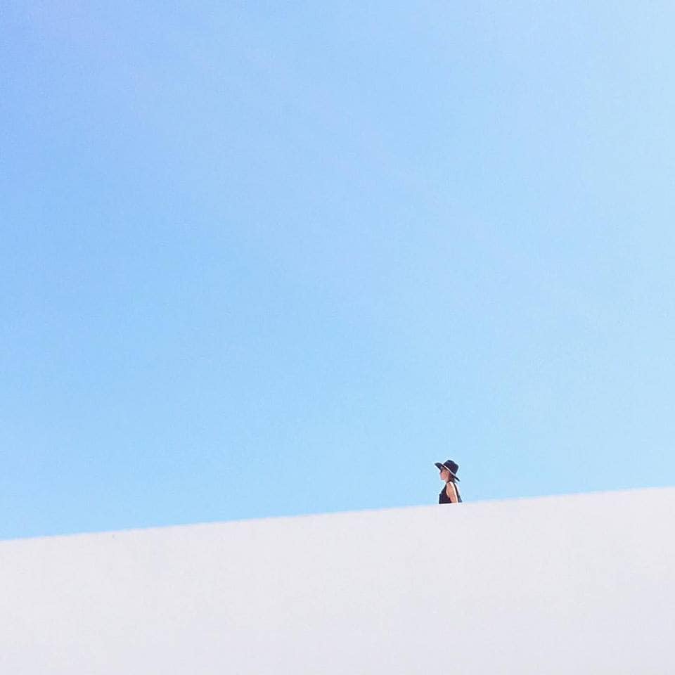
4. NEGATIVE SPACE IN THE SQUARE FORMAT
Negative space is another great compositional resource that you can use in your 1:1 photos and it works great. Leave a clean image and focus all attention on the subject.
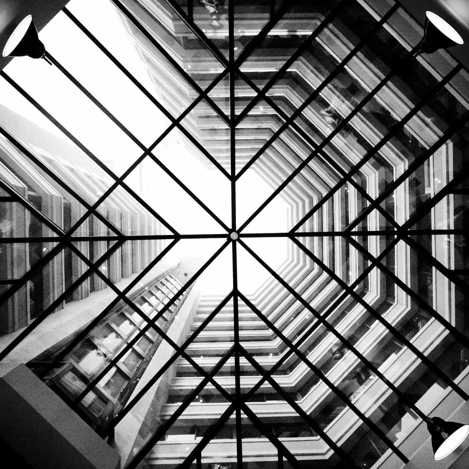
5. INCLUDE GEOMETRIC SHAPES
Geometric shapes are also highly favored with the square format, perhaps because of the special geometry that it offers, because of symmetry or balance, we don't need to know the cause, the important thing is to know that it works (and very well).
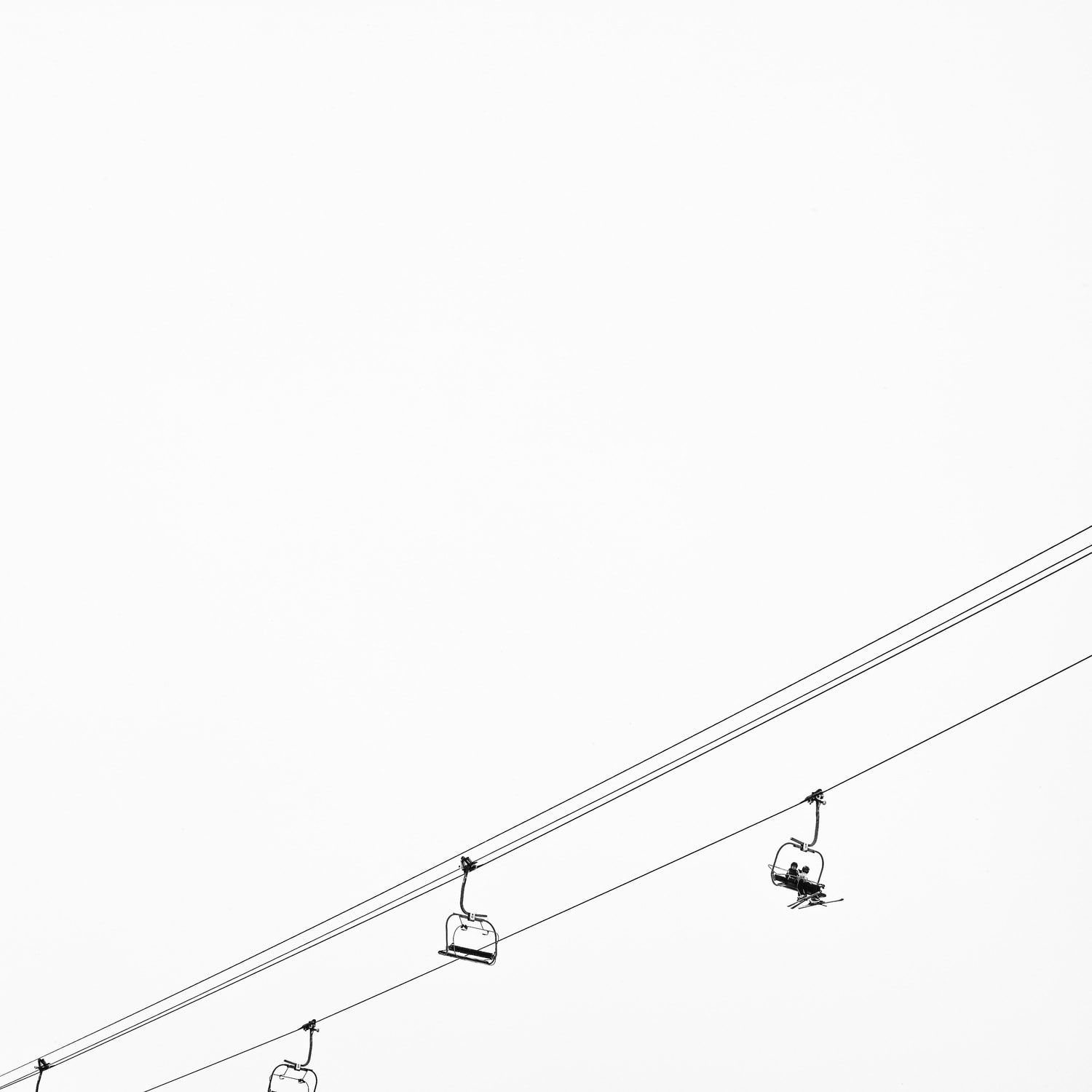
6. MINIMALISM IN SQUARE FORMAT
Less is more. We have repeated it many times on the blog (and will continue to do so), but it is the truth. That is why minimalist photographs are so strong. What you may not have known is that minimalism looks even better in a square format. I encourage you to do the test, for the moment I leave you an example image.
7. RULE OF THIRDS
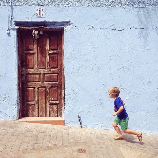
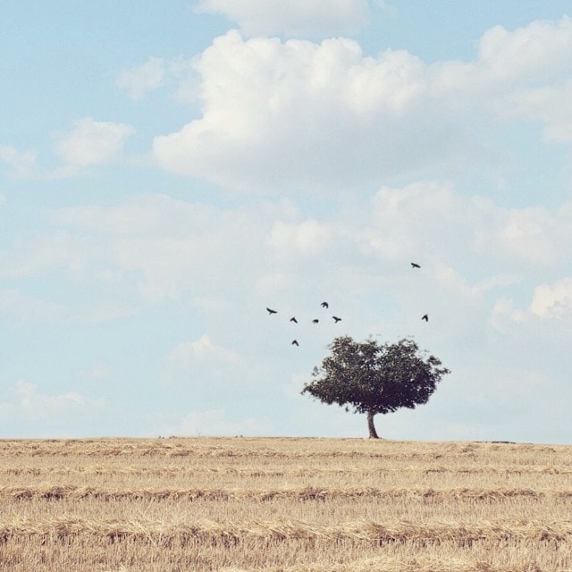
Before we have discussed that the square format admits very well that the motif is placed centered, however, that it is not necessary to use the rule of thirds does not mean that it cannot be. In fact you can, it works well and is applied in the same way as in the standard format. Some examples:

8. SYMMETRY
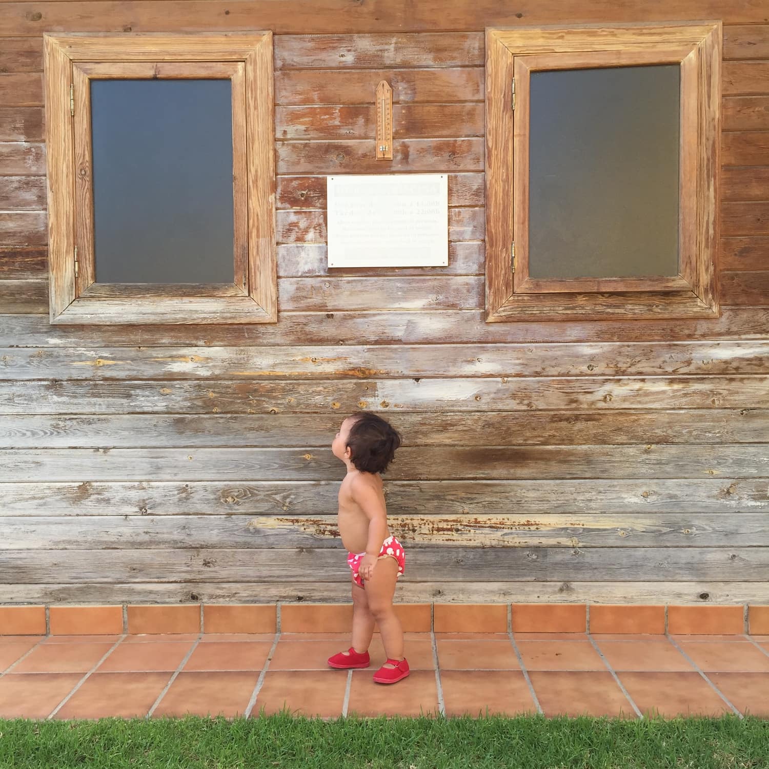
Symmetrical images within a square see their symmetry reinforced. The balancing effect is enhanced by this framing. Take advantage of this effect when photographing symmetries, although be careful, try to break the symmetries a bit so that it is not too boring.
9. BALANCE
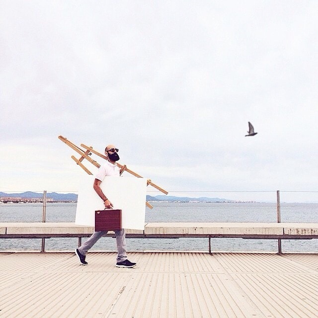
I have already told you that the square format in itself gives balance to the image, even so, make your composition balanced . Don't let your photo walk a tightrope ? Do you see that little bird flying in the following image of Emilio Chulia? Well, he is not there as an ornament ?
10. NATURAL FRAMING
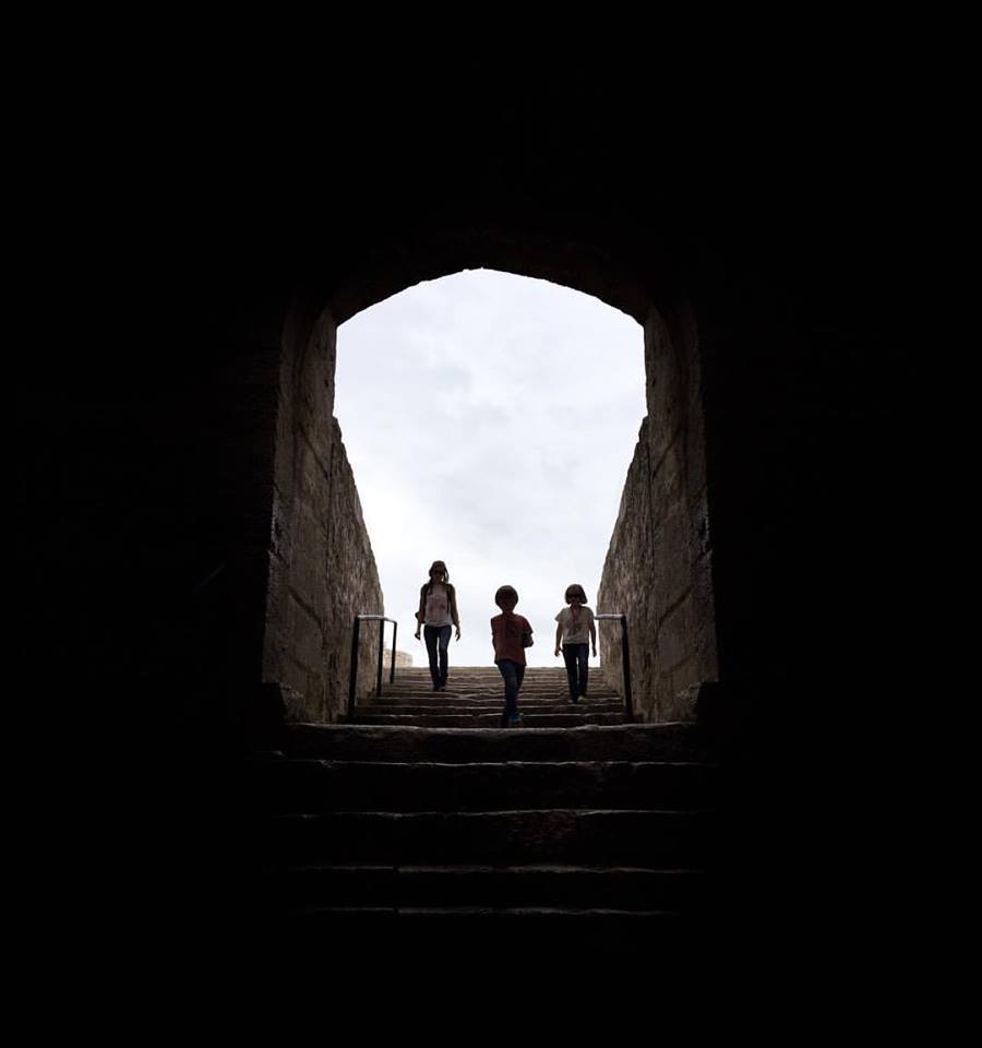
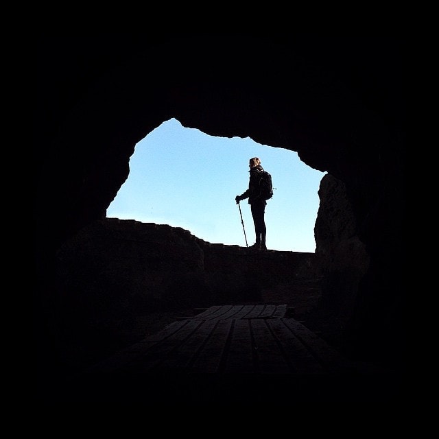
If you thought that natural framing still didn't work too well in the square format, you were wrong ? Give it a try. Meanwhile he left you two samples:
11. FILL THE FRAME
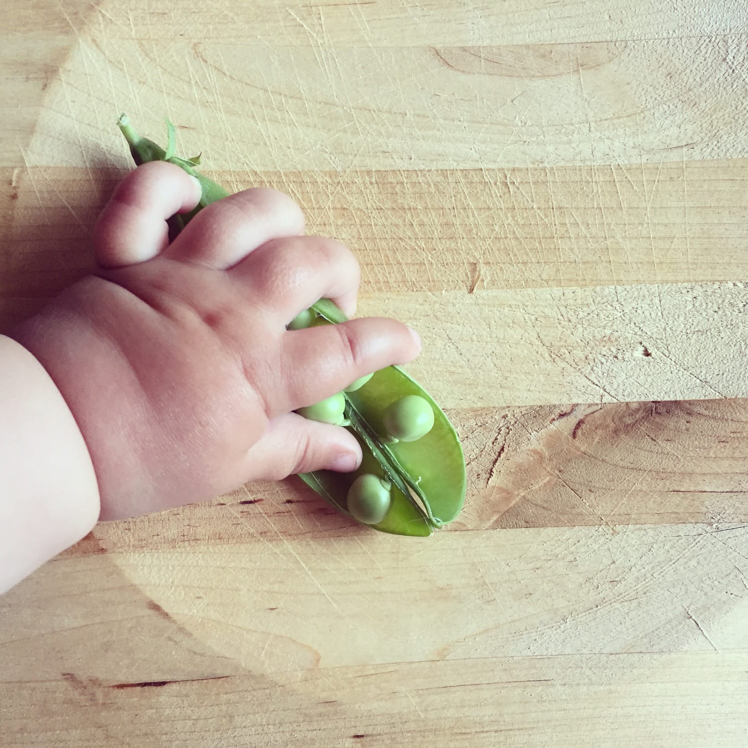
A few weeks ago I was talking to you about the impact you can achieve by filling in the frame . The differences are also noticeable in the square images. A simple trick that can turn an uninteresting image into a highly attractive one.
AND HOW TO GET THE SQUARE FORMAT IN PHOTOGRAPHY?
You may be wondering how you can photograph in this format that I have been talking about throughout the article. Well, there are different options:
Editing: Photo editors have a cropping feature. This is the option you have when you shoot with an SLR, since there are no square sensors ? Although I recommend that if you want a square photo, think square when shooting, no matter how much you crop in the editor. You can also try cropping when an image in standard format does not finish convincing you. On more than one occasion you will discover that it looks better in this format! You have a lot of editors for free online .
Smartphone: for those who shoot a lot with their mobile phone, the square format is usually more affordable, since the camera usually has different shooting modes: panoramic, standard, square, video... This way it's very easy to compose because you don't have to imagine, you directly see how it looks. ( Tip: you can use your mobile when you have doubts when shooting with your SLR about how an image will look in square format.)
Instant cameras: Many of these cameras, whether Polaroid or other brands, develop square photos instantly. Have you never tried them? Here you can learn about instant cameras in depth.
SQUARE FORMAT WITHOUT EXCUSES
You have already seen how easy it is to shoot in square format, and it is also very grateful. After light, composition is the most important element of an image. You already know how to compose in a square, now… what are you waiting for to shoot?

