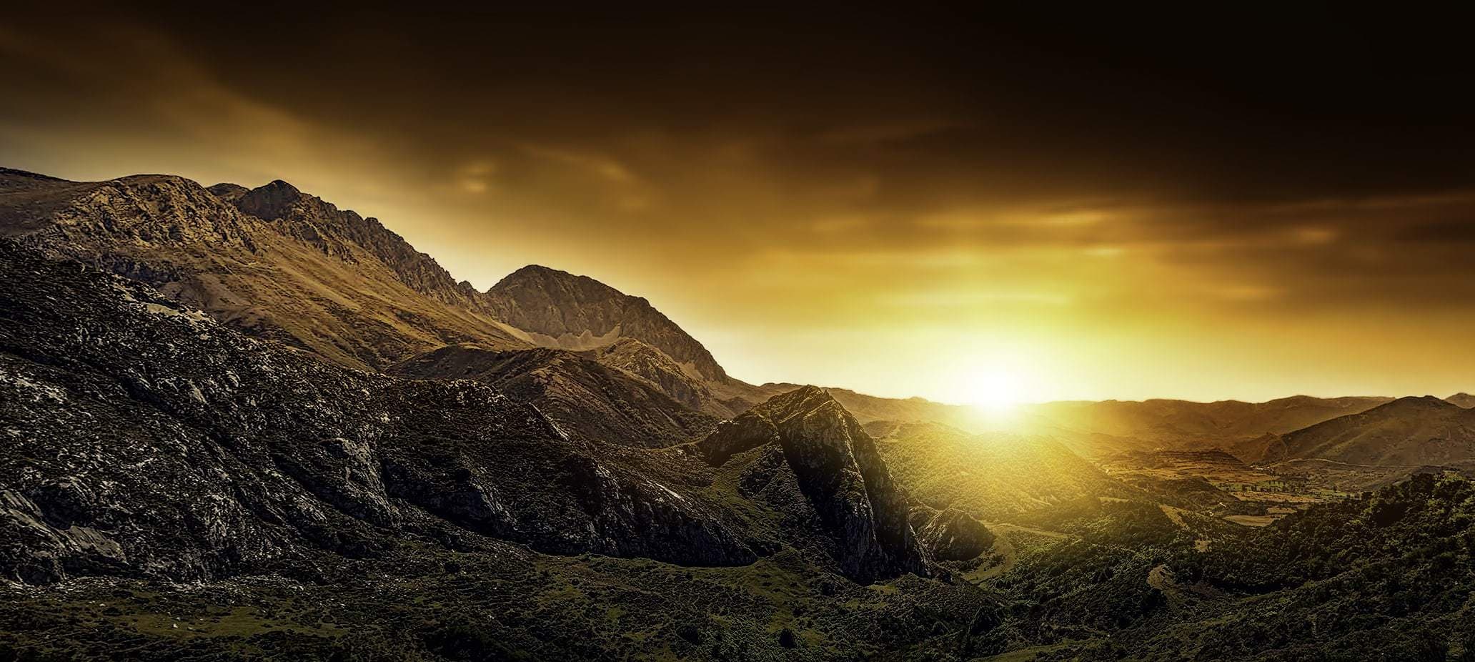
It is undeniable that landscape photography has many followers, mainly because of the strong attraction they exert. Of course, you are in front of a beautiful landscape, with a beauty that almost makes you cry. You want to retain it in your retina (forgive the redundancy), you would like to leave it in your memory, framed, and refer to it whenever you feel like it, every time you want to enjoy that spectacular beauty again. But memory is treacherous, it does not retain as clearly, nor with as much reality, much less for as long as you would like. Therefore, the best resource is to photograph it, because it is the only way to catch it with your hands and take it home, for you, forever.
THE DISAPPOINTMENT
But sometimes you take it with you and when you open it on the computer, you get the disappointment of fifteen. Where is the charm? It is no longer that you cannot smell the flowers or the sea like when you were in the place, nor perceive the breeze, nor hear the waves or the birds. All this you already imagined when shooting. But no, it's something worse, it's that the landscape is not at all as attractive as you've seen it, it doesn't seem half as beautiful and you don't know what went wrong, because the histogram said that the exposure was correct, the balance white was the right one, but something is wrong... and you don't know what it is. Well, I'll tell you what happens most of the time. It is a composition error. You get so excited with the landscape that you think you only have to control the light, the depth of field and little else (which is not little ? ). You see the composition so beautiful in front of you that you don't think it has to be taken into account, but it is not. There are a few very typical mistakes that you should be aware of in order to try to avoid them at all costs. Do you stay to meet them? Besides,In this very complete article on landscape photography you will find all the keys to achieve the most amazing images.
1. CROOKED HORIZONS
A sloping horizon is not creative or attractive unless it has a very clear intention and is well understood when viewing the image, such as giving the impression that it is something steep that a hiker has to ascend, so to speak. But usually, it's a very silly oversight that happens often and is very annoying. You can kill yourself a cool photo for a little distraction like this. If it happens to you, feel free to correct it with any image editor. You don't even have to have photoshop installed. Here are a few online editors , if not all, most should come with the straighten option.
2. FORGETTING TO INCLUDE AN ITEM OF INTEREST
An image must have a center of interest to which the viewer's gaze is directed, otherwise, the photograph will go completely unnoticed, it will be boring and lacking in interest. In a landscape it can be an animal, the sun, a cabin, a boat, or even a rock. There are hundreds of elements that you can use as a prominent center of your image, what happens is that given the beauty of what you are seeing, it is very easy for you to forget... Remember it well, because later when translating that landscape into two dimensions and with the limits of the frame, you need something that gives it that strength lost in the path of the diaphragm.

3. ELEMENTS THAT GET IN THE WAY
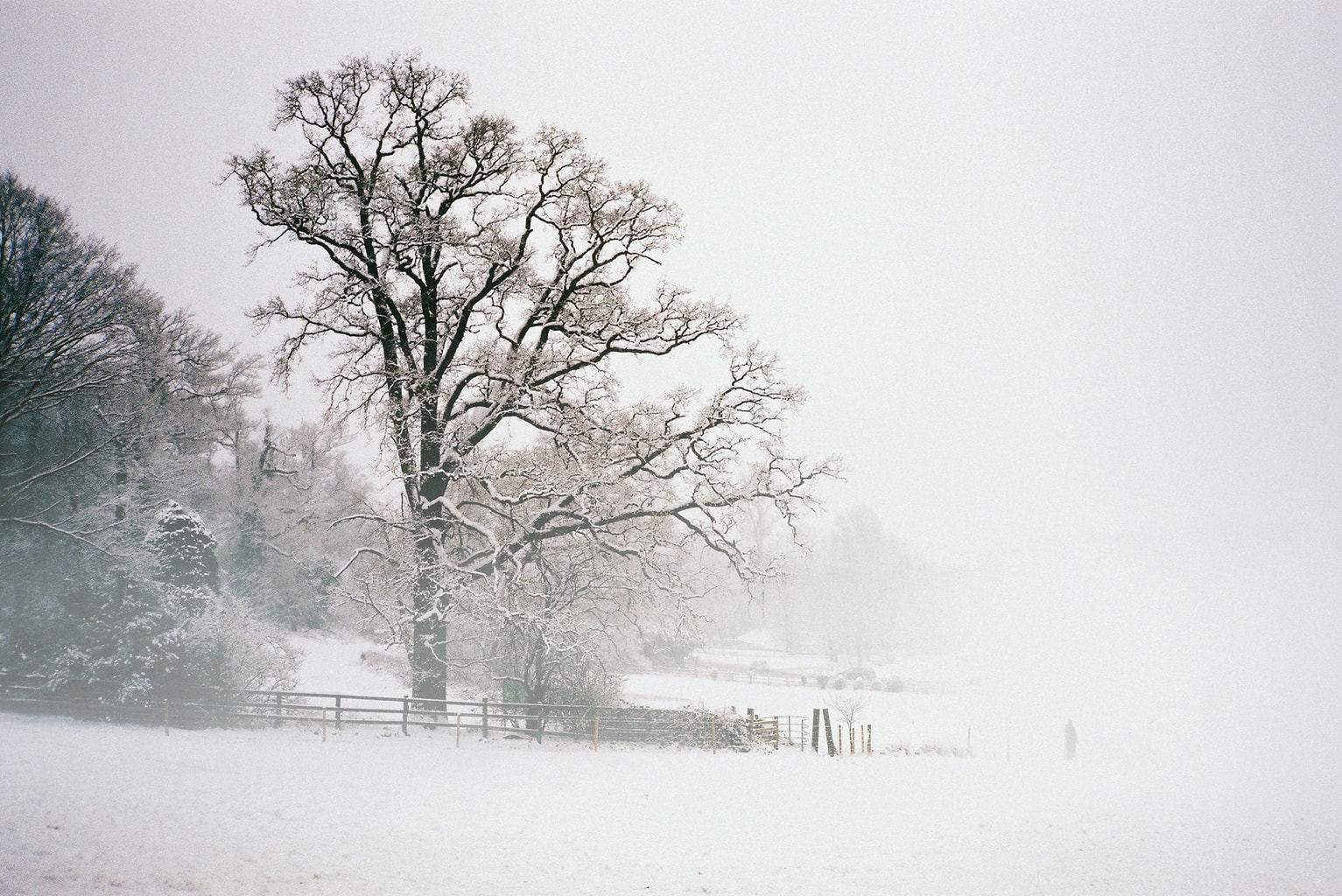
Once you have identified your element of interest, you must isolate it to give it greater prominence. If there are other similar elements very close, on the same plane or just behind, they will take away from your point of interest and the image will have less impact. Observe the following image, the tree that is just behind the main one, mixes with its branches and reduces its visual appeal. This can be corrected with a change of perspective, if possible that behind the tree that you want to highlight there is sky or snow, or the trees behind are further away and/or out of focus. The second image is very similar but it is better resolved, don't you think?
4. FRAME ONLY HORIZONTALLY
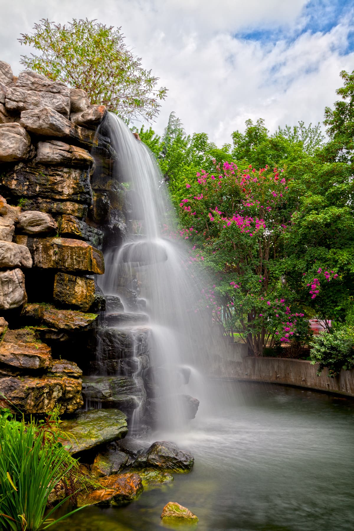
The most normal thing when framing a landscape is to do it horizontally. This is for several reasons, because it transmits calm, like landscapes, because it is the natural shape of the camera and because it is more similar to how our eyes see. That's fine, however, there are situations in which a landscape can gain (and a lot) if we change the frame vertically. When? Well, when we want to bring dynamism to a stage or when the "image" in front of us asks us to do so. For example, in the following image, don't you think that vertical framing is the most appropriate in this case?
5. STAYING IN THE "NORMAL" PERSPECTIVE
When I say normal perspective , I mean the perspective that results from shooting at eye level. It is what we are used to with and without a camera, for this reason, an image taken from that point of view does not add anything new, it does not impact as shooting from a lower or higher point can. Risk a little and you will win a lot, don't be afraid to dirty your clothes ? .
6. DO NOT GUIDE THE VIEWER'S GAZE
A photograph must not only be looked at, it must also be read. If you want to capture the viewer's attention, you must ensure that his gaze travels through your image and decides to stay on it. If you don't do this, it will simply hover over the image for a moment and skip to "something else butterfly." Not guiding your gaze is photographic suicide. Sorry to be so dramatic but... it is what it is ? . You can do it through a point (center of interest), two points (elements) that are read as a line, through lines or shapes (for example, the incomplete circle of a rainbow).
7. UNINTERESTING OR BORING BACKGROUND
We love clear skies. We clap our ears when we look out the window and see a blue sky, with no lurking clouds, the entire celestial vault of an intense blue... how wonderful, isn't it? If it is about photographing landscapes, it is rather the latter. Because? Because, despite being a guarantee of safety for your equipment (that is, there is no risk of it getting wet), a flat blue sky is very boring in an image. That doesn't mean you can't go out and shoot landscapes on a day like this. But giving importance to that sky is a very recurring mistake. If you don't have attractive clouds, or a sky of colors at sunrise or sunset, don't let it occupy more than a third of your image, or what is the same, take away its prominence.
8. BREAKING THE RULES WITHOUT A CLEAR INTENTION
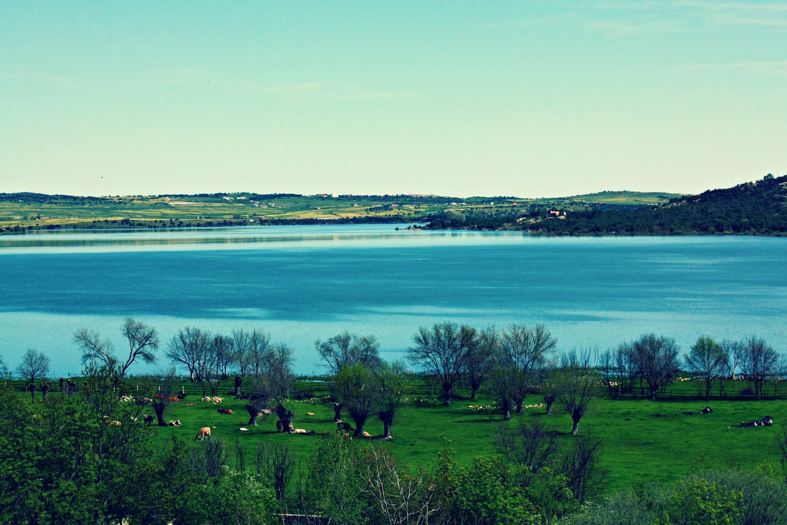
Yes, yes... we already know that the rules are meant to be broken , but... do you know them? Do you skip them with a clear intention? If the answer is no to either of these two questions, or both, I recommend that you review the laws of three thirds and the horizon , key in photographic composition. Yes, it is true that you do not have to comply with them to the letter, but skipping them to the bullfighter for not paying attention or for thinking that the landscape is already beautiful in itself, is another mistake as typical as it is serious.
9. LACK OF DEPTH
See the image below? What produces a great sensation of depth? Well, this is something that is often forgotten to convey. We shoot without taking into account the need to include elements in the different planes and the image ends up being flat, as if the parts of the landscape were on top of each other instead of behind.

10. FRAMING ONLY THROUGH THE VIEWFINDER
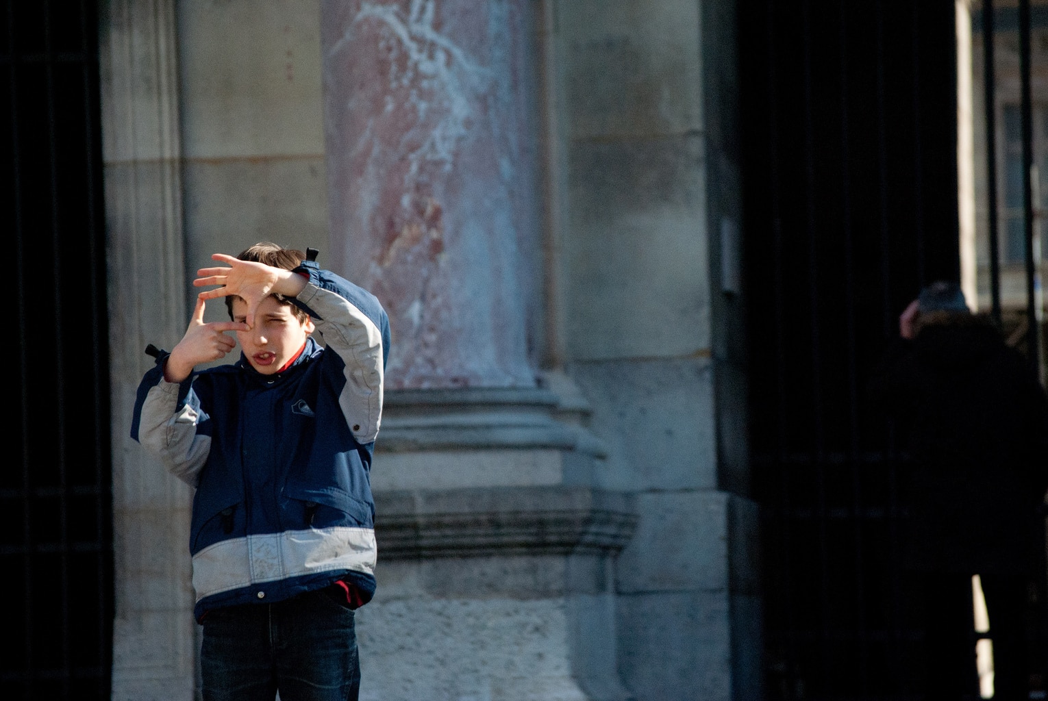
Many times, due to the desire to photograph everything we see, we make the huge mistake of not taking the camera off our eyes. What happens with this is that we only look through the viewfinder (or the Live View screen, in some cases) and the consequence of this is that framing is often missed. It is necessary to see the whole scene with your eyes wide open, with all your angle of vision, study it and from there, choose the best frame . Help yourself with your hands to select which part you want to immortalize and change the angle, posture, position...
11. FORGET BLACK AND WHITE
It is normal to think in landscape and to think in color. But staying there is a typical mistake that you should avoid. The colors of the landscapes are wonderful to portray them, but there are times when black and white can give the scene a very special touch and add more drama. Don't forget about him ?
Now it's so easy for you to drive… you don't have to think about putting the clutch down, you just do it. Well, the same thing will happen to you with photography, there will come a day when you will not have to think about whether the horizon is straight or not, if you have framed it correctly or if you have managed to capture depth, you will simply do it without realizing it. What do you need to get to that point? You already know… practice!!
Well that, you're already taking a while ?, but first I'll ask you a favor, small for you, big for me. Share this article on Facebook or Twitter and you will make me happier than a partridge ? . Thank you and see you soon!

