Who is not fascinated by the portrait and who, with a camera in hand, has not made hundreds or thousands of them, am I wrong? And of those hundreds or thousands, how many have convinced you, with how many have you thought, “Here is a great portrait-what a photo-this is my thing” . Let's be honest, if we remove those in which the model moves you (because it's your daughter or your son, so objectively perfect ? ), those that you find exotic because you went on a trip to Botswana, or a few daring attempts in Street- photography that at first seemed “the best” but anyway, ahem… How many would we save by being generous? 10%? 5% for the most demanding? 15% for the “less demanding” (or better portrait artists ? )?
There are many ingredients that can cause your portrait to fail: shaky, out-of-focus, over or underexposed images... these are the most classic errors, but we have another variable that, without being an error, can make your image magnificent or bland. You know what I'm talking about, right? Do you want to know how to go from 10% to 30% (no miracles either, huh? ? ) thanks to composition? Read on then, but before I continue, let me recommend the mega guide that Mario prepared with many more portrait photography tips, tricks and inspiration (more than you can imagine).
1. RULE OF THIRDS
Perhaps you are tired of hearing about it, but in portraits it can be especially useful, not only because it will help you place your sitter within the general frame, but also because it can be very useful when placing what you want to highlight from your face, for example the eyes, which are usually the main or the most prominent subject of a portrait.
Remember that the rule of thirds divides the frame into three vertical and three horizontal parallel lines. The points where these imaginary lines converge are known as strong points , and it is there where our eye stops most naturally, so it is there where it is recommended to place our center of interest .
2. FRAME VERTICALLY AND HORIZONTALLY
I won't insist on horizontal because I bet that 95% of your portraits and your photos in general are horizontal. The explanation is logical and simple, if we see horizontally and the viewfinder is horizontal, the easiest thing for us is to frame horizontally. However, you'd be surprised at how many images you have that would work much better vertically. Take the test, the vertical format has many advantages, among them, it allows you to more easily fill the frame with your character, and eliminate the background whenever it is not interesting to you. This does not mean that you abandon the horizontal format, but it does mean that you give the vertical format a chance from time to time ?

3. THE NEGATIVE SPACE IN THE COMPOSITION OF PORTRAITS
One way to wrap your protagonist without him losing prominence is to place him within a frame with negative space . A wall, a door, a texture, can help you compose your image, give it more weight and interest, but at the same time, without diminishing the center of interest . Remember that it is important where you place your subject and in what proportion, depending on what you want to convey.
4. THE LAW OF THE GAZE IN THE COMPOSITION OF PORTRAITS
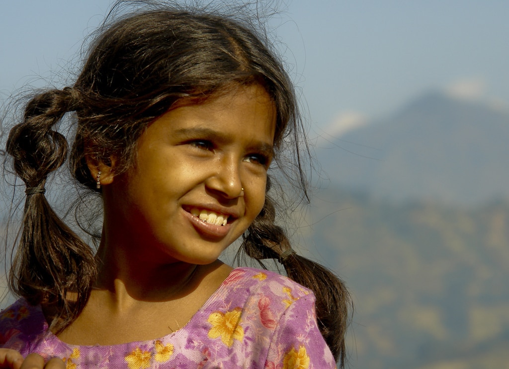
Another classic of portrait composition that you should know. The law of the look says that more space should be left in the place of the frame to which the protagonist's gaze is directed. In this way, the image “breathes” more naturally and we perceive it as more balanced.

5. THE BACKGROUND, AN ESSENTIAL ELEMENT IN THE COMPOSITION OF A PORTRAIT
He is usually the great forgotten of photography in general, but also the one who usually ruins many photos that could have been great. A pole, a tree or an unknown lord appearing out of nowhere can completely ruin your composition, so before you shoot, take a look at your surroundings.
6. HELP YOURSELF WITH LINES IN YOUR PORTRAIT COMPOSITION
Lines are a very common element in photography, which help us to compose and direct the gaze towards the point of interest. You have lines in everything that surrounds us, they can be physical or those created by the elements that make up the image, but used well, they can help you point out your protagonist or make the viewer's gaze wander through the image in the way that you want.
7. COMPOSITION OF VANISHING POINT PORTRAITS
Related to the lines, the fugues are the place where those same lines converge, literally or imaginary. They act as a guide for the gaze, focusing visual interest where the lines intersect; at the vanishing points.

8. LET NOTHING DETRACT FROM YOUR MAIN SUBJECT
We have already talked about the background, but it is not the only way to "watch" your center of interest. Remember that a large diaphragm opening will be useful to isolate your protagonist by blurring the background or what surrounds him whenever you need it.
9. FILL THE FRAME
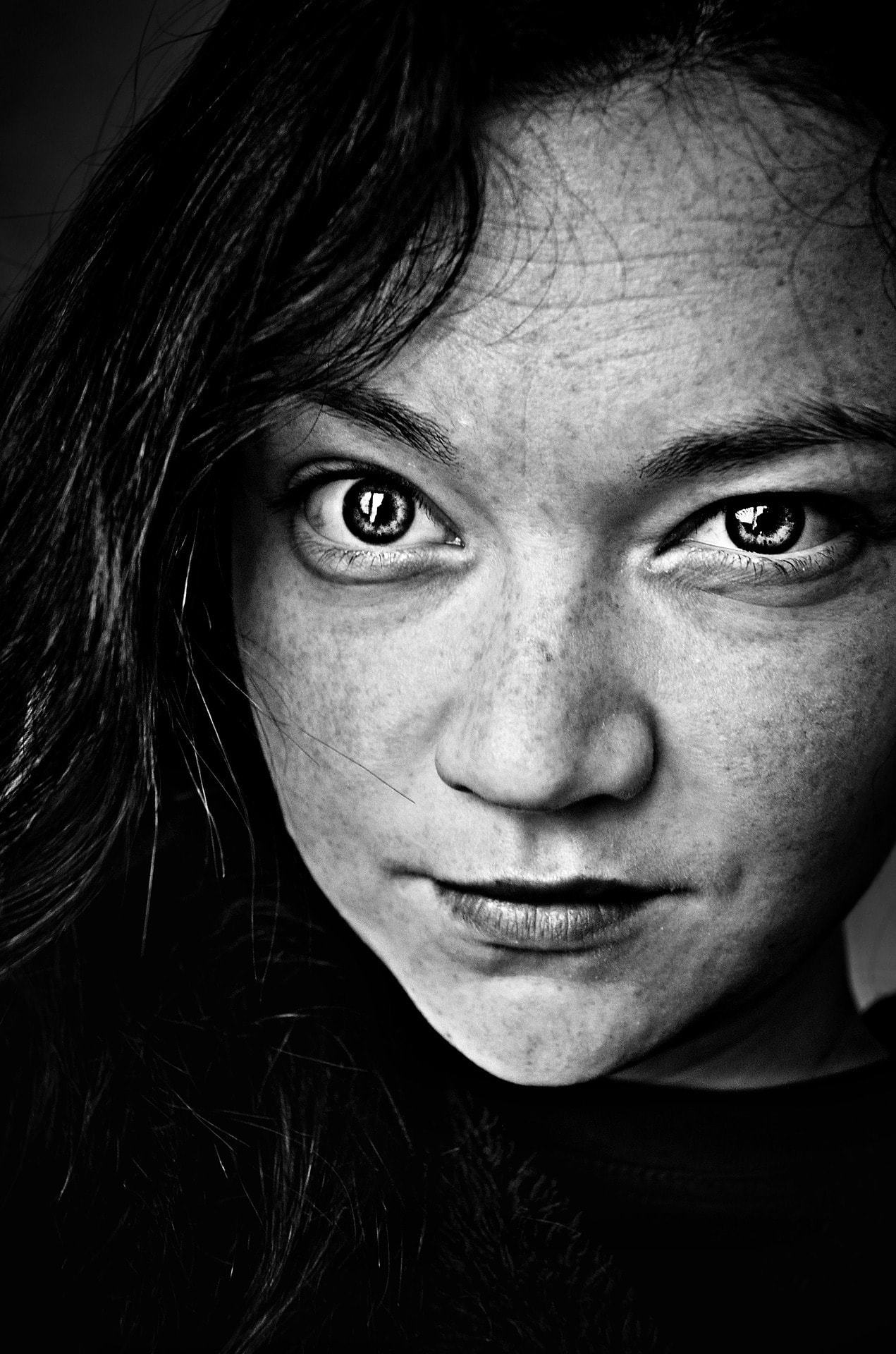
It is usual that at the beginning we tend to move away or stay away from the subject, either out of shame, lack of confidence or because it may be easier for us to frame. Be that as it may, forget your fears or embarrassment in a drawer and get as close as possible, fill the frame with your face or with the detail of your pupils, you already know that if a photo is not good enough it is because you are not close enough ?
10. IS THE GAZE INSIDE OR OUTSIDE THE FRAME?
The two options are equally valid, although they convey different sensations. An in-frame look can be used as part of the narration of the scene (a mother looking at her baby) and an out-of-frame look is more mysterious since we don't see what the protagonist is looking at.
11. COLOR AS A COMPOSITIONAL ELEMENT
Unless you decide that black and white is your thing, color is going to play a huge role in your portraits. You can use it to add contrast to the rest of the image, to complement it, to isolate the protagonist, etc.
12. NATURAL FRAMES IN PORTRAIT COMPOSITION
Do not forget to take advantage of the environment to increase the interest and/or originality of your portraits. Door frames, bridges, caves, the branches of a tree or the frame of a window can be very useful to add weight to your portraits and make them different. In addition, the natural frames will serve you for any type of photography ?
13. DO NOT FORGET THE EYES, THEY ARE YOUR MAIN CENTER OF INTEREST
Unless you have decided to focus on another point of your protagonist's face to highlight it, in portraits you should focus on the eyes as carefully as possible. In case you work with large diaphragm openings (larger out-of-focus area in the image), try to focus on the eye that is closest to the objective .
14. COMPOSITION OF GROUP PORTRAITS
Do not forget that beyond "short first", group portraits can be much more exciting and with better results if you work the compositions in a more original way. Remember the importance of keeping them all within the area in focus (closing the diaphragm) and that they are all in an area of homogeneous light (or some will appear dark or burnt).
15. BE ORIGINAL IN THE COMPOSITION OF PORTRAITS
You already know many tricks and rules, but that does not mean that you cannot create your own, the ones that work best for you or with which you feel most comfortable. Varying the perspective, the point of view, the motives, the framing, the backgrounds, playing with the colors, the contrast and a long etcetera will help you to investigate and delve into the different techniques that exist or invent your own ;-). So grab your camera, remove the cover and get ready to create your new and better “portrait” version, your images will thank you ?

I hope you have found the article useful, if so, share it on your usual social network. And as always, Thank you! See you around here ?


