20 TRICKS TO PLAY WITH COLOR IN YOUR NEXT PICTURES
20 TRICKS TO PLAY WITH COLOR IN YOUR NEXT PICTURES
Almost 80 years ago of that first and negative color breaker that revolutionized the way of capturing and interpreting images in photography. Most of us were born in the age of color. Color televisions, color reels, color digital cameras. Everyone is in color. This should make things easy for us to know, right? The truth is that it is like our mother tongue; Knowing and speaking it does not necessarily mean knowing how to write it, doesn't it? How many years ago the human being communicates orally and how many years ago does he know how to write in a generalized way?
The exact same thing happens with color. Knowing "speak in color" does not necessarily mean knowing "write it", for that you have to know a little bit about the "alphabet of colors" that luckily is much shorter than that of our mother tongue
So first we go with a few basic notions about the color that will help you learn to play with it:
BASIC THEORY ABOUT COLOR
Tone : It is the color itself; the essence of color (green, yellow ...) only we usually use the word "color" instead of tone, but the meaning is the same.
Brightness or luminosity: It is related to the lightness or darkness of a tone. The more brightness, the lighter it will appear, and the less brightness, the darker it will appear.
Saturation: It is the degree of color purity . A more saturation more purity of color, and less saturation colors more "muted" until reaching the minimum that is considered neutral gray.
Chromatic circle : It is used for the classification of colors from the combination of the three primary colors (red, yellow and blue), and the secondary colors (green, orange and violet). Be careful, the colors red, yellow and blue are "primary" in paint, but in photography the primary colors are red, green and blue.
Complementary colors : Those that are located "face to face" in the color circle; the opposites The combination of these produces a strong contrast between them.
Warm colors: Oranges, yellows, browns, golds, reds ... All of them are "warm" colors because they usually have a subjective feeling associated with warmth.
Cold colors: Greens, blues, and violets. As the name implies, they cause a subjective sensation associated with cold.
Harmonic colors : Colors that work well together, which are accompanied without contrasting or contrasting with each other. A combination of different warm colors would create a harmonic image based on warmth, for example.
And now that we have entered a little bit about the most basic aspects of color, we are going to see 20 tricks so that you get wonderful color images:
20 TRICKS TO PLAY WITH COLOR IN YOUR NEXT PICTURES
1. COLOR SPACE
Regardless of the result you want to get, when shooting in color, it is recommended that you adjust the color space to Adobe RGB . Most digital cameras come with sRGB by default since this format takes up less space, but with Adobe RGB, the amount of color stored is greater, and therefore greater is its detail, its approximation, and its accuracy.
2. WHITE BALANCE
Another adjustment that you should make before considering taking color images is the white balance , especially if you do not shoot in RAW. The white balance is nothing more than the color temperature. There are warm orange, yellowish lights, cool bluish or greenish lights. You can correct them until you get a neutral tone in your image or you can play with those same tones, to obtain different images.
3. CONTROL EXPOSURE
As a photographer, one of the things that is sure to lead you is learning to control exposure. It can be a small mistake or a big mistake, but the truth is that any adjustment you make to modify the exposure in your image will alter the original colors of the image, so if you don't want that to happen, if you want to be as faithful possible to the image before you, try to expose as accurately as possible.
4. HIGH KEY COLOR
The high-key images are those in which light, white, clarity dominates. Those that inspire positive feelings or purity. That is why it is easy to see this technique associated with images of children or babies, but the truth is that you can use it in any context; You just need a white background and lots of light.
High key color
5. LOW KEY COLOR
The low key color transmits the opposite to the high key. This is based on darkness, mystery, strength or elegance.
Low key color
6. THE NEGATIVE SPACE
The negative space is another element of the composition of your images. It is based on distributing the image through a main element or center of interest , and a more or less ample space "empty" or with little information, so that this "negative" space enhances the main element or "positive space" within the composition
Negative space in composition
7. MACRO PHOTOGRAPHY
Surely on more than one occasion, macro photography has caught your attention. The possibility of portraying giant ants, petals, snails on such a scale is fascinating, right? Surely you also find it fascinating the "blur" so sharpened it causes and that gives us images of a beautiful pictorial effect as in the following image. If you like the effect that well-blurred background colors create, try opening the diaphragm to the maximum to reduce the depth of field and you will get an effect not as pronounced as the macro, but more affordable if you do not practice this type of photography.
Macro photography
8. MONOCHROME AND COLOR? HOW?
As a photographer and at the same time a spectator, surely you agree with me that in general we all like the images that surprise us in some way. It is not necessary that this image is not even strange, many times you only need an element that stands out above the rest to activate our interest . There are many cameras that allow you to choose a color from the image to keep it and the rest of the image transform it to black and white. You can also do it quite simply in Photoshop and other image retouching programs. And if you don't have any of the above options or you don't feel like using them, you can look for a handful of gray stones and a cherry, it's all about imagination.
9. CONTRAST AND COMPLEMENTARY COLORS
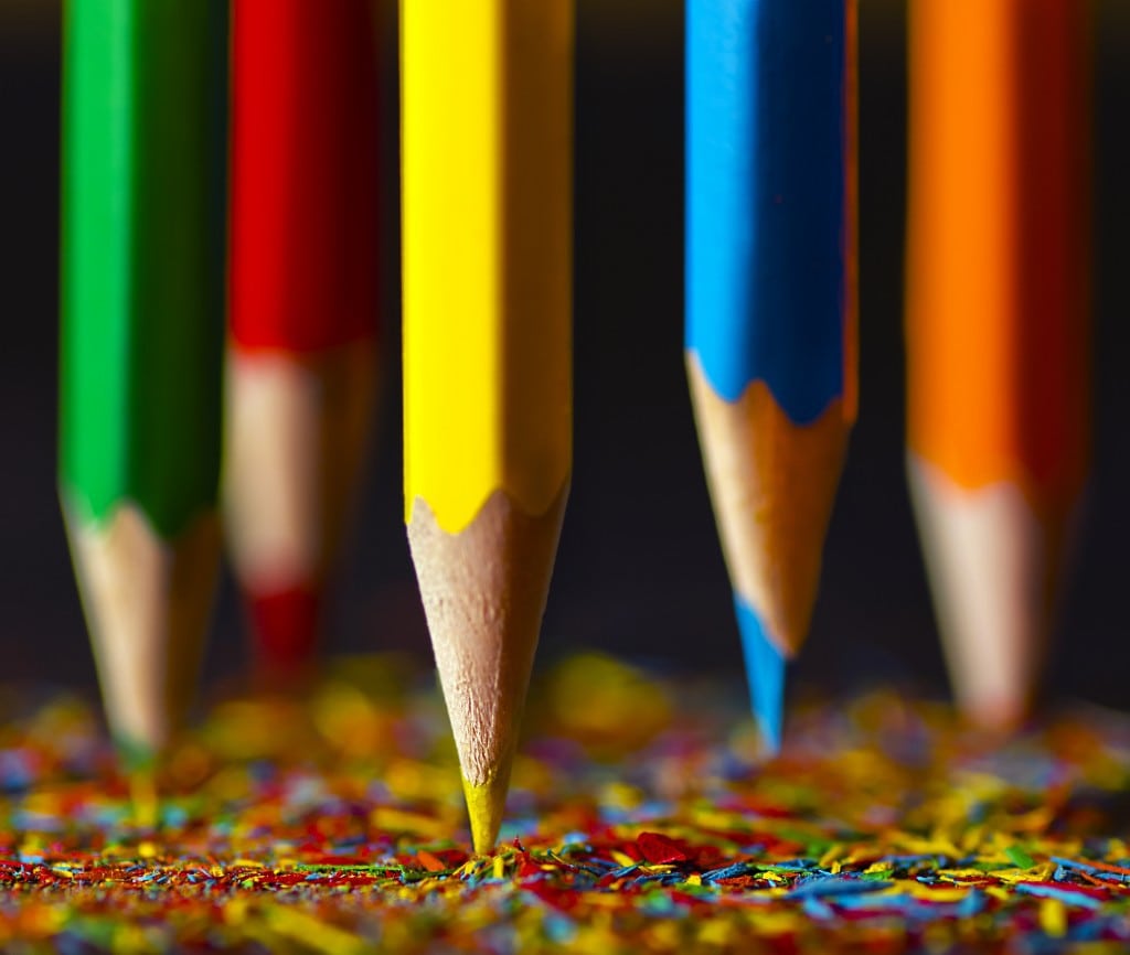
In the introduction to color we talk about complementary colors such as those that contrast in the color circle. These colors combined with each other, have the highest degree of visual contrast you can get in a color image. For example, yellow and blue are complementary. If you combine them in an image you will have a very contrast image where both elements will be enhanced by the combination with their opposite color.
Complementary colors to generate contrast
10. MIX OF WARM AND COLD COLORS
Visually speaking, cold colors "recede" and warm colors "advance" in the image, did you know? Curious, right? Surely you find a way to exploit it in your color images
11. CREATE YOUR OWN COLOR COMPOSITIONS
Many times the best images are the simplest ; those that anyone with something of desire, imagination and photographic eye can build in a short time and anywhere. Look at the following image and you will see what I mean
Create your own color compositions
12. LIGHTS AND SHADOWS
Color is another element of the composition , and as such, you should not forget to combine it with other elements that add interest to your image. The games of light and shadow can provide you with magnificent images worthy of the best impressionist painting
Color and shadows
13. BOKEH EFFECT
Yes:
a) You have a goal with a good diaphragm opening
b) You like to try new things
c) You have a tripod
d) You like the image you will see below
Then you have to try the bokeh effect , you will love it, and the color results are incredible. Yes you can. You can do amazing things without Photoshop!
Bokeh Effect
14. FILTERS
To increase the contrast, eliminate brightness, highlight the warm or cold colors of a scene, for infrared photography or for artistic effects. If you enjoy color photography, at some point you will have to use one of the filters recommended in this article.
15. AT ALL HOURS?
If you like color photography you can not miss the wonderful light of a sunrise or sunset. The colors, the textures, the light that is breathed in those hours is unique, do not miss it. Photography can be practiced at all hours, but not every hour will give you the same images.
16. REFLEXES
By now you will have discovered the benefits of elements such as shadows or reflections to improve your compositions and to make them more interesting, am I wrong?
17. TELL A STORY IN COLOR
The best images are always those that explain to us some concept that comes to us or that we can understand. We always say it and I don't think we never get tired of doing it. Your images must speak, they must explain something to us, they must move us, make us smile or dislike us, but we must feel something when we look at them. And you are in charge of transmitting that emotion to us. How about? Hard? Of that nothing, let yourself go and you will see that it is simpler than it seems
18. COLOR AND EMOTION
The colors each have many associated emotions. A red does not transmit the same as a green or a yellow as a blue. Let's see above how each color entails or causes particular feelings.
Red: Passion, heat, danger, prohibition, risk and strength.
Blue: calm, cold, responsible, sky and sea.
Yellow: Cheerful, bright (it is the brightest color of all), aggressive, vigorous.
Green: The color of nature par excellence, purity, growth, progress.
If you were going to photograph your newborn nephew on a red background, you may be rethinking it, right?
19. RAINBOW
Nature always gives us wonderful images to lovers of color photography. Its trees of infinite shades in autumn, the birth of its flowers in spring, its insects of colors and impossible designs ... but also its atmospheric phenomena full of colors like the rainbow. If you are not lucky to hunt for this beautiful phenomenon, why don't you take a bath? Or do you prepare it with you outside? Soap bubbles are capable of reflecting the same colors as the best rainbow you have ever seen. (If he does not practice at all times it is because he does not want ...)
20. PRACTICE (YOU)
This trick is the best of all, the one that will help you most, teach, motivate and inspire. Without this we are nothing. Without it, the camera would return to its original box in less time than it took to change shoes. To be better, to understand the light, to free yourself from rules and norms and infinite tutorials and questions ... you have to practice. And a lot. Until you get fed up ... and start over, because you will see, passionate or passionate about photography, the passions are not left just like that, they always end up coming back and sometimes even more strongly, because when something touches us it is for something. I'm sure I'm not talking about anything that doesn't sound like you.
And you know, if you liked it, it has been useful and / or you think it may be useful to someone else, please Share it! Thank impassioned @ fotó graf @ !