Note from Mario: Today I am especially happy to welcome Alexa, my new collaborator on the blog, who from today will have a weekly contribution full of photographic tips and tricks in line with what we have been posting on the Blog of the Photographer until now, but with a very unique voice and look. (If you like children's photography, be sure to follow her blog https://snapanappy.com/). – Welcome Alexa!
The concept of negative space has been used for hundreds of years in the world of composition in art (painting, architecture, design and sculpture) and, of course, in photography.
If you want to delve into photographic composition and find out all the tips and tricks for some of the most impressive photographs, take a look at this mega guide that we have prepared for you.
Now, we go with the negative space.
WHAT EXACTLY IS NEGATIVE SPACE?
Negative space is everything that surrounds our main subject without providing 'relevant' information, that is, it is the area that accompanies, embraces your image, but is not the protagonist in itself because it lacks weight, is flat, or contains very little information (smooth textures, flat colors, black or white background…)
WHAT DO YOU GET WITH NEGATIVE SPACE?
Give prominence to what you really want to highlight, to the main element of your image, because the lack of information in negative space makes your eye instinctively go to what contains important information (what we also call positive space). For our visual system it is very natural, since it needs something to focus on; in a completely homogeneous field of vision, he becomes disoriented.

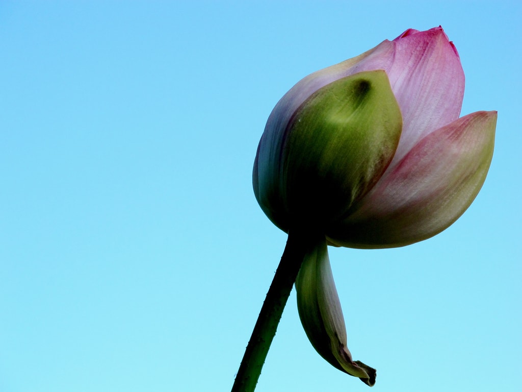
In the previous photograph you can see this effect clearly. The flower is the main subject; what before we have also called 'Positive space', while the negative space would be the blue of the sky that surrounds it. As you can see, blue accompanies the flower, embraces it, enhances it, but does not take away from it.
Once the negative space is presented, we are going to see how we can use it to achieve fantastic and inspiring compositions with it.
NEGATIVE SPACE AND COMPOSITION:
Negative space for 'minimalist' compositions
When you place your main element surrounded by a vast negative space , you get somewhat abstract images, which usually inspire calm, peace or solitude, always depending on the motif and the tone of the negative space. Used well, providing a lot of negative space around the subject can convey an infinite number of feelings, it makes us look at an image and stop before it, and stop seeing to feel it.
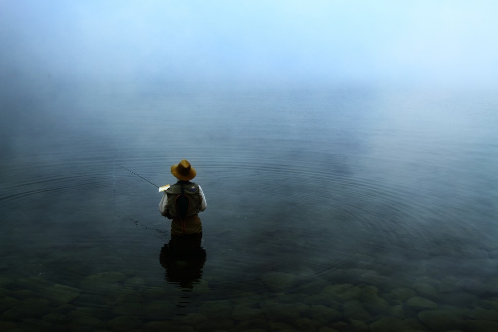
Isn't it true that the following image produces something like that for you? The fisherman in the middle of the water and the fog, without a horizon, without any element that diverts our attention from him. Doesn't it make you want to know what he feels, what's going on? (By the way, surely the fog that surrounds the fisherman has also caught your attention, isn't it inspiring? Well, if you're interested, Iaio wrote a great article on fog that you can't miss... You can read it here .)

Negative space in front of the main subject (or positive space)
Placing the negative space in front of the main subject usually creates the feeling that the action is progressing from it, that the photograph is breathing and projecting its message forward. It is perhaps the most natural way for the eye to frame the negative space, because it is the one that best adapts to the succession of gaze-thought that we exercise when looking at an image.

Negative space behind the main subject.
This way of locating the negative space is more shocking for our perception of what happens in the image, because the image breathes, it has air (from behind), but our protagonist seems to collide against the frame of the photograph, which can convey to us a certain overwhelm or the sensation of a somewhat dramatic image, since we usually project our gaze in progression to the center of interest and we hope to see space where the action is directed.

Negative space above the center of interest.
If you place the negative space above the protagonist of your photograph, the feeling you get is that the action is happening upwards, which we normally associate with the sky, flying, or freedom.
Negative space below the center of interest
If, on the other hand, the negative space is placed below the image, it may appear that it is floating, since it does not seem to have anything below it to support it. Look what an interesting effect Eduardo Martínez, a participant in the challenge on this topic, achieved by applying this negative space technique under the boat. (If you want to see more images about this challenge, you can see them here. )
Once you have decided how you want or what you want to inspire with your photography, you should not forget to combine it with the basic composition rules, as Iaio explains in this magnificent article on framing and composition. If the image is well composed, and the negative background complements it, you will surely obtain spectacular images.
HOW TO ACHIEVE NEGATIVE SPACE ON A TECHNICAL LEVEL?
Now that you are clear about what negative space is and how you can place it within the frame of your photograph, you may wonder how you can 'fill' that space and if you are doing it correctly.
For this there are some more aspects to take into account, because 'How do I place it?' Like 'What do I fill that space with?'
Colors in negative space:
If you are photographing in color, it is very important to think about what color you are going to make that complements the subject of your image. For example, if you are photographing a flower that is a certain shade of yellow and you fill the negative space with the same type of yellow, the flower in this case (positive space) will not stand out from the rest of the image, so it will lose the color. effect sought with this technique.
So before you shoot, think about how you are going to make your protagonist stand out. You can do it through complementary colors, or with other very interesting techniques such as high and low key photography, which are closely associated with this negative space technique. You can read about high and low key photography in this fantastic article by Mario here .
Play with depth of field:
If you don't currently have a background to fill your negative space that satisfies you, you can do something as simple and effective as playing with depth of field. As you probably already know, the larger the diaphragm opening, the less depth of field (more out of focus area in the image). This will get your subject in focus, and the rest of the image out of focus. If it is minimally homogeneous and there are no elements that stand out too much, you can also achieve a very interesting negative effect.
What do you think of this technique? It is very easy and effective, so do not stop practicing it, because when you least realize it you will have it so integrated that you will no longer even need to think about it, the photographs will come out alone and they will surely come out magnificent. That is the key to photography, it is not studying great monographs or attending expensive courses, or having the best camera on the market. It is to try and try and try again, it is learning to look and think before shooting, it is learning to visualize the photo we want before pressing the button, and by doing it hundreds of times, you will completely forget the rules of composition and of all those things that a priori seem so complicated. You will forget everything because it will already be part of you. And you know what? That moment is magnificent but it can only be achieved by practicing. So… what are you waiting for?


