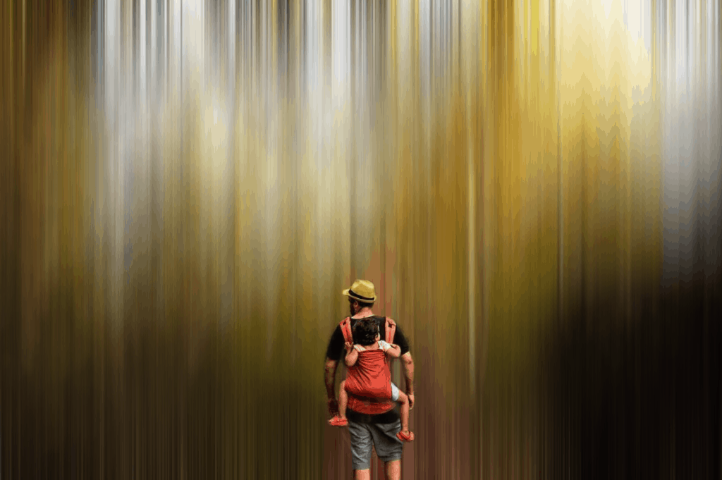
Adamski effect? And why, what is it? You may wonder. Well, a few weeks ago we started our gait in the new weekly challenge format that we nicknamed fotoreto . I don't know if you will remember that the first one was about the subject: black and white photography, this theme that we both like (and) like. It turns out that the winning photograph turned out to be a wonderful image with a beautiful impressionistic effect . This effect is called Adamski Effect , and as we know it caused you a lot of interest, we wanted you to have the tools to do it step by step.
WHAT IS THE ADAMSKI EFFECT?
The Adamski effect owes its name to its creator, Josh Adamski (Tel Aviv 1948), a photographer who defines his work as a photo impressionism himself. Through blur techniques and creating the illusion of movement, his images adopt an abstract tone, often dreamlike and pictorial. His style has become popular and it is increasingly common to find images imitating his technique. I recommend you take a look at the gallery that appears in this link for more inspiration.THE CHOICE OF THE IMAGE
The first step begins long before opening Photoshop on our computer. The first thing is to choose the image on which we want to work. This step is essential . I would even tell you that for the next few times, it is not only essential to choose the image, but to create it thinking about applying the effect later. This is how you will really get the best results. Here are some ideas that work very well with the Adamski effect, then you will see why:- Tree trunks or elongated repetitive patterns (buildings, street lamps, trees, etc.)
- Images with very marked vanishing point
- The sea and the movement of the waves
- A sky with clouds
- A human element in photography
- Open frames
HOW TO CREATE THE ADAMSKI EFFECT IN PHOTOSHOP
The truth is that doing so is very simple and can be a very useful tool to give a creative touch to your images. I recommend that you apply it once the image editing is finished.FOR IMAGES WITH VERTICAL AND HORIZONTAL ELEMENTS
Let's see it step by step for images with vertical and horizontal elements such as a landscape with trees, for example. The first thing is to choose a suitable image to apply the effect, open it in Adobe Photoshop, and triple the layer. To do this you just have to place yourself on top of the bottom layer, and with the keyboard shortcut, dial "Control J" twice. Once you have three layers, you must give each one a name. One will be "vertical", the other "horizontal" and the other "background" (it will be the original photograph).- Angle
- Distance in pixels
CLEAR THE ADAMSKI EFFECT SELECTIVELY ON IMAGES WITH VERTICAL AND HORIZONTAL ELEMENTS
As I have already mentioned, in some images this could end in the previous point. But in my image, for example, I have a human element that I don't want not only to not have a horizontal filter, I also don't want it to have it vertical. I mean, I want a certain area of the image to be "free" of Adamski To do this, we continued from where we had left it with the following steps: Select the vertical and horizontal layer and put them in a group by clicking on the folder.SUMMARIZING:
- We add two layers to the bottom layer with the Control J key
- We give them name: vertical, horizontal and background
- We apply the motion distortion filter to the vertical and horizontal layers
- We add a mask to the vertical layer
- We erase with the brush in black, the areas that we want to keep the effect horizontally.
- If we want an element to be without Adamski effect, we continue from here.
- We create a group with the vertical and horizontal layer
- We add a mask to the group
- We erase with the brush in black color and a low opacity
- And ready. You already have it
IMAGES WITH ONLY VERTICAL / HORIZONTAL ELEMENTS
Your image may only have vertical or horizontal elements. In this case the philosophy is the same although it is something easier to do because we skip a step. It is the case of the image that I have given you as an example: as I had hardly any horizontal lines, what I have finally done is simply to enhance the verticals and erase the effect on the people in the photo. This has been the process:- Duplicate the background layer once
- Give it the name "vertical",
- Apply the filter at 90º
- Add a layer mask
- Erase with the black brush the area where in my case I have the human element, and with an opacity of approximately 20%, and that's it.
The HTML CheatSheet has its built-in editor where you can preview the document you are working on.


