I don't know if you have ever considered to what extent the format in which you take your photographs conditions the final result. It is possible that you intuit it in a certain way and that, by practice, intuition, or vision, you take advantage of each one of them without being very aware of why.
Today I have proposed to explain to you that photographic formats go beyond square, rectangular, vertical or horizontal. I come to explain the theory, the reason for each of them, their strengths and weaknesses.
Because maybe there was something you missed when using them, because maybe you hadn't been too excited about the rest of the formats, because knowledge doesn't take up space and because you always learn something new that can be useful (at least I hope so ? ) .
That being said, we are going to see the different photographic formats and how to get the most out of them.
THE VIEWFINDER
Yes, although it is not a format in itself, it is evident that we compose the images through it (mostly). This first aspect is the first to determine the final result of our photographs. What we see is rectangular in a camera designed to work horizontally.
Although (with practice) we can abstract from what we see through the viewer and compose in other formats, the truth is that a priori this conditions us a lot.
THE HUMAN EYE
Viewfinders and cameras have not been designed horizontally for no reason or to annoy those of us who like the vertical format ;), they have been designed to adapt to the human gaze, which not only conditions the design of our cameras, but above all our way of making and reading images.
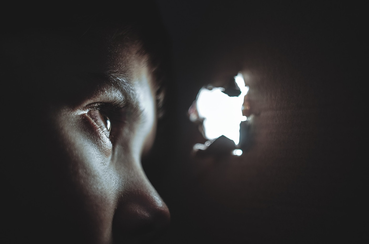
Human vision is horizontal, binocular (two eyes) and is characterized by focusing sharply at a narrow angle while the surrounding image gradually blurs as it moves away from the point where we focus. However, the eye moves quickly across the scene, allowing us to have a perfectly sharp image as we scan the scene without even being aware of those blurry areas.
FORMAT 3:2
After this short introduction, let's see which are the most common formats used in photography today, starting with 3:2 which, if you come from the analog world, is surely very familiar to you, since it is the one used by the standard film with which that the vast majority of photography fans used to work.
This type of format is directly inherited from the 35mm and is characterized by elongated proportions. It is the format that best suits our intuitive horizontal composition system, as it perfectly suits our vision, the horizon and the organization of the elements in horizontal format. If, on the other hand, we choose to work vertically, we will see that it also adapts well to the human figure or to markedly vertical elements.
In this format, the directionality is very marked, whether we work horizontally or vertically, and it greatly conditions the composition and the result of the image.

4:3 FORMAT
It is the format that most low or medium range amateur cameras and mobile phones have adapted as it is considered the most natural format. In this case, the directionality is not as marked as in 3:2, and they are better suited to the eye and especially to screens and prints.
It is surely the one you use if you work in digital. It adapts very well to both vertical and horizontal images, especially the former.
Its strong point is the malleability of its proportions, which allow lines and compositions to be worked on comfortably and not so marked and predefined by the shape of the frame itself.
SQUARE FORMAT 1:1
Although platforms like Instagram have made it very fashionable and now it seems like a very common format, the truth is that, until now, it was intended for very specific and specific images.
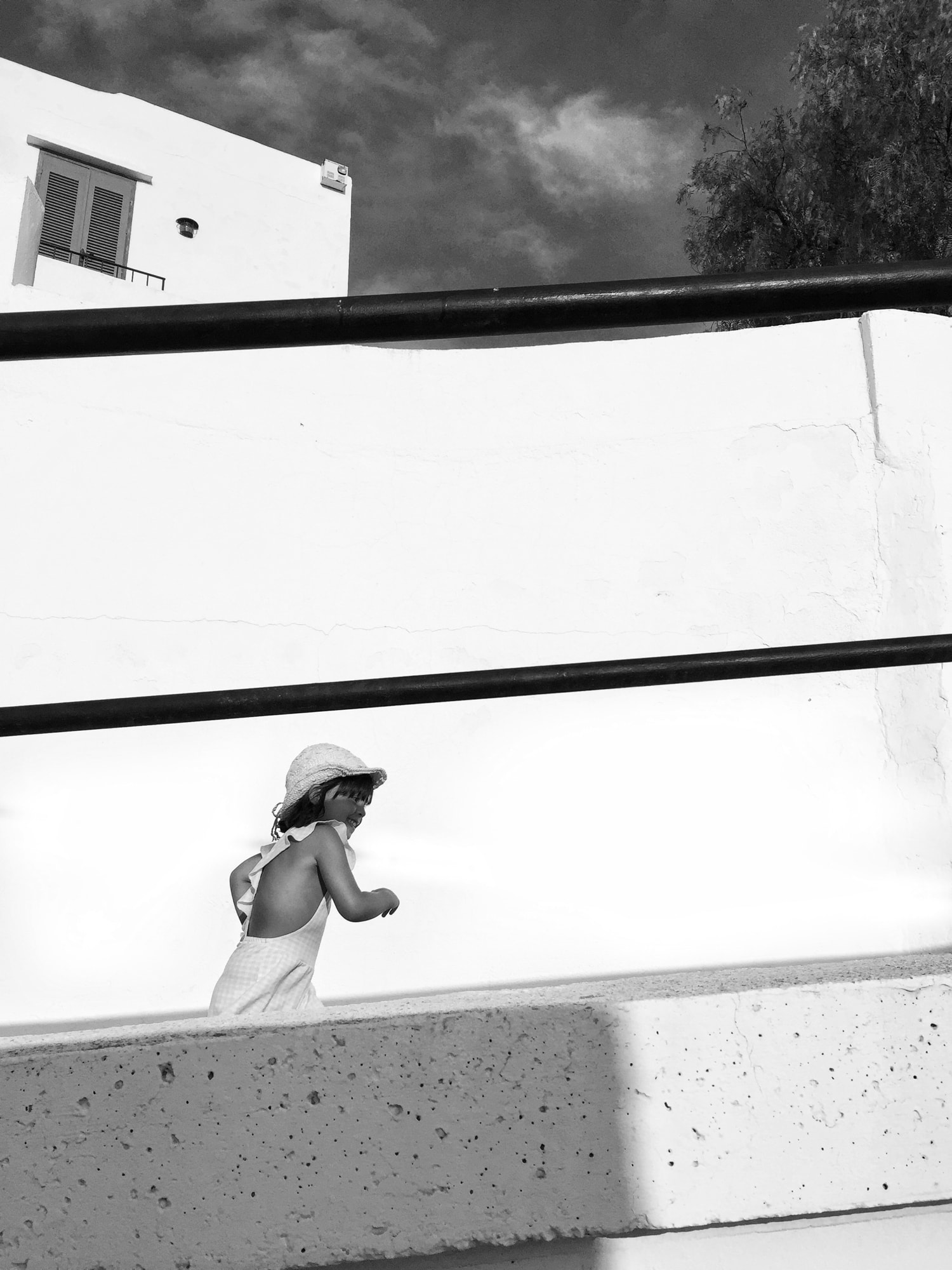
Composing in a square format is not always easy, since its symmetry, balance and lack of directionality can easily make us fall into compositions that are lacking in interest or unbalanced (usually all the elements have a dominant line that we usually adapt to the longest side of the frame). .
To escape the boredom of symmetry (which can be interesting at times, of course, but not always), you have to try to break it in your composition. Well through the negative space, the lines, the situation of the main element in the frame, the color, etc.
PANORAMIC
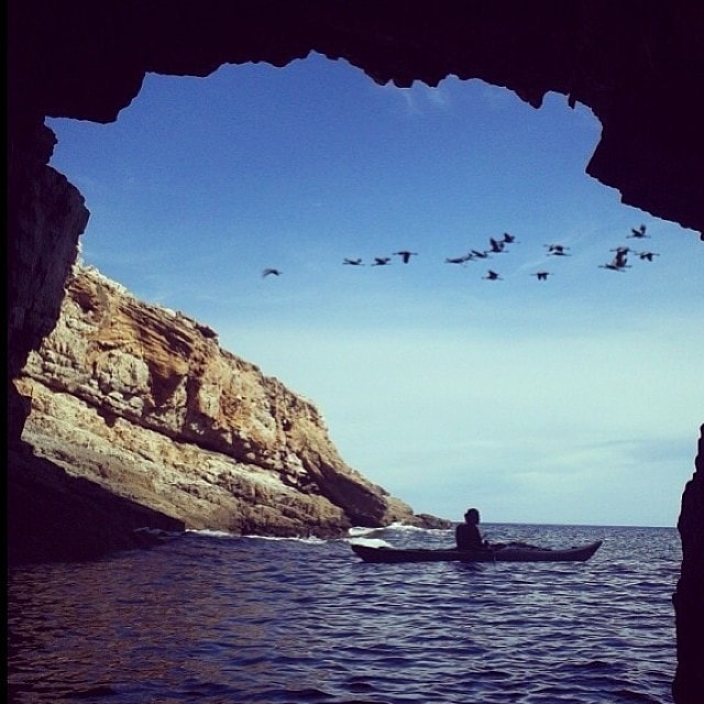
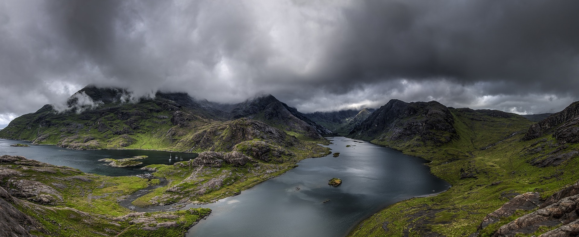
We have already talked about how horizontal images have a natural appeal to humans. Panoramic photographs are the culmination of horizontality and, thanks to the editing tools, we don't need a specific camera or great knowledge to make the most of its possibilities.
However, panoramic photographs require a mental anticipation of the result; that is, we must imagine the image beforehand and choose the best composition without seeing the result until we work on editing it.
Today's panoramas are nothing more than a succession of images that go through the same scene, placed one next to the other through an editing program that is responsible for making them fit perfectly, creating an image without interruptions. .
That is why we must anticipate its appearance in terms of composition and framing and also with respect to how many photographs we want to use. The more we use, the more elongated the image will be, but it will make you progressively lose the upper and lower area of the photo (it will be narrower), so there is no need to go too far ;).
And of course, don't hesitate to get out of the conventional and get to work on vertical panoramas . You'll be surprised ;).
It is evident that each format has its utility and its moment, right? although it is possible that for your day to day the one that works best for you is 4:3; Not only because it is the one that comes by default in most non-professional cameras and in smartphones , but also because it is the one that best adapts to different screens and print formats.
And here is today's article. I hope you have found it interesting and that it has helped you to be aware that the photographic format we use not only exists but also greatly conditions our images.
Do you dare to try something different? Do it, you will see how it forces you to make more effort in your compositions, it will open your mind and boost your creativity.
But before doing so, don't forget to share this article on your favorite social network so that it reaches as many people as possible. Thank you and see you soon.

