Like any good lover of photography, surely you have read the odd article about mistakes to avoid in photography, right? Well, they are without a doubt great tips that you should learn and keep in mind. But, what if I told you that many times you can turn photographic errors into your best artistic and creative allies? Because photography, like any art, is not limited to a series of unbreakable rules; photography, and art in general, has evolved thanks to innovation, discovery, originality and the daring of many before you and me, who created trends and to whom we largely owe the 'rules' that we apply today when we capture an image.
The only thing that you should always keep in mind, because it is what differentiates a 'simple mistake' from a let's say 'artistic' mistake, is to think beforehand about what you want to do, what you want to obtain by breaking that specific scheme. Of course you can also find a casual creative 'mistake', but it should not be the norm, since the important thing is to use it while being fully aware of it, in order to get the most out of it.
If you want to delve into photographic composition, and know all the tips and tricks, don't miss this mega guide that we have prepared for you.
Now, without further ado, let's see some examples of how to turn your 'mistakes' into creative photos:
CREATIVE 'MISTAKES' IN PHOTOGRAPHIC COMPOSITION
There are many ways to 'err' compositionally, we know that there are rules of thirds and the golden ratio among many others, but don't you think that if we all always followed the same rules, all the photographs would be very similar?
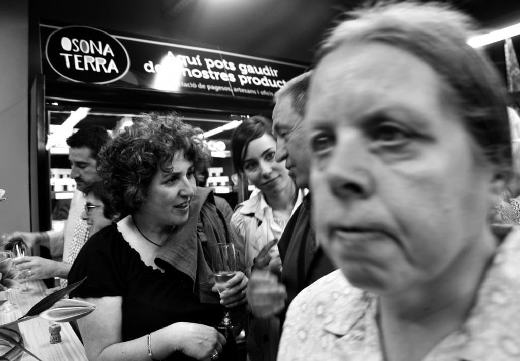
Unfocused foreground: It is perhaps a more photojournalistic style, in it we see an unfocused foreground and a focused background, two stories in one image. Perhaps what our brain claims for naturalness is the focused foreground, since it is more natural, but by breaking this pattern in this way, you can achieve a different and more original effect.
Center the main object of the image: One way to break the rule of thirds is to center our object of interest. Whenever it is justified, know why you are doing it and what you are going to get a priori. Look what great examples came to us through the 'centre' challenge.
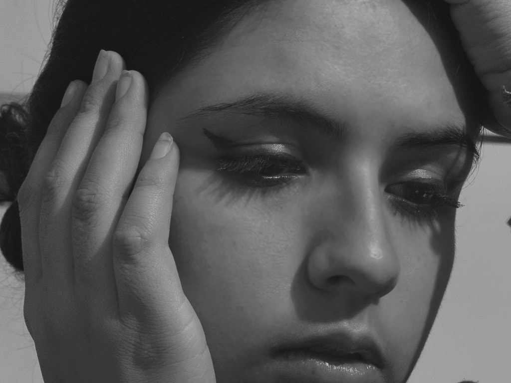
Cut off heads, feet, hands... : Well, why not? You can get really amazing effects if you dare to do it. From intense gazes in portraits, to interesting street photographs. Think that you are leaving out everything that you have left over at that moment; therefore, what remains is gaining a lot of strength, you are giving it meaning; the viewer of your image understands that what is missing is out for some reason.
For example, in the following image, this technique has been used for a portrait. The chin is cut, the hands, the lip, the forehead... which makes you fix your gaze on the eyes, despite the fact that they do not look at the camera, but are lost in something outside the image that we cannot see .
If you want to delve deeper into this composition technique, you have a great article on this type of portrait here .
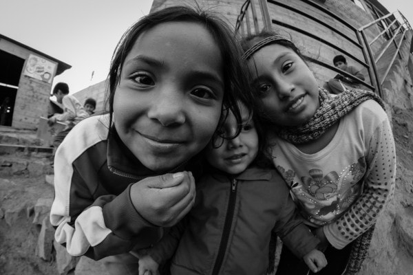
A fisheye for portraits? Yes, despite the fact that the effect achieved will be far from being a photograph that is faithful to reality, something that you must take into account beforehand, the lenses called 'fish eyes' can provide you with interesting perspectives, even in portraits.
Look at the following image how it encompasses the different planes of an image, the three girls in the front, the boy on the stairs on the right and two other children playing behind them. Isn't it true that the optics and the chosen framing create an interesting effect?
CREATIVE PHOTOGRAPHIC 'MISTAKES' WITH COLOR
When you 'face' an image, you should always keep in mind what kind of light is illuminating the scene. To do this, we always adjust the white balance of our camera, to avoid those greens in fluorescent lights, those orange tones from indoor lights (tungsten lights) or any ambient light that hinders the final result of the image. However, knowing how to play with color temperature when capturing your images can open up a new field of expression for you, oneiric, more artificial and subjective, since a predominantly warm image does not express the same thing as a cold bluish or green image. If you justify their use, they will help you tell different stories in your photos.
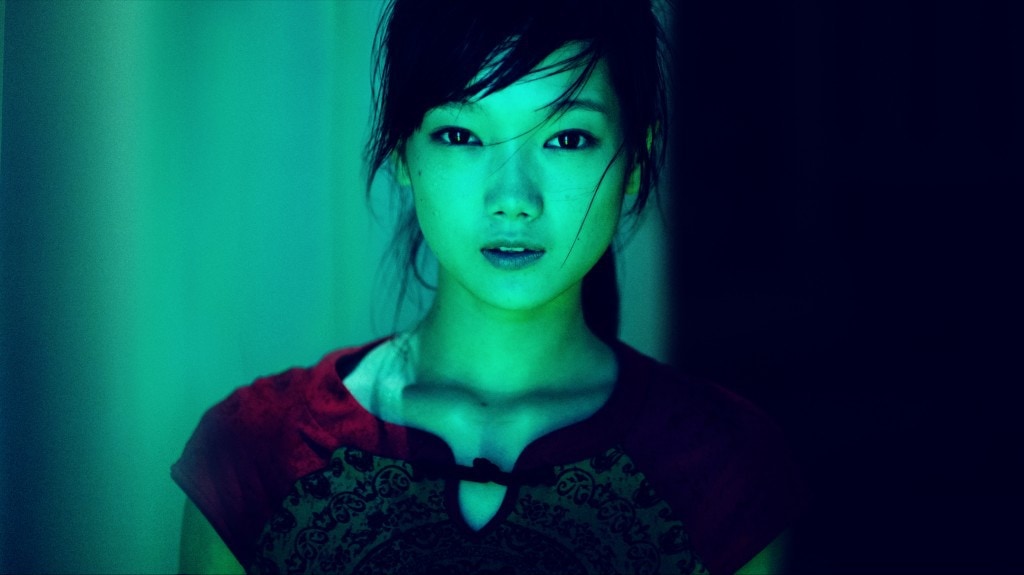
If you need more information about white balance and color temperature, Mario explains it very clearly in this comprehensive article.
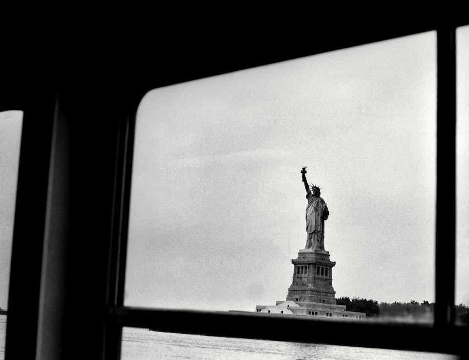
High Contrast Images: You've probably already learned how to read your camera's histogram, if you have any questions, you can check everything you need to know about exposure here .
Roughly speaking, a high-contrast image leads to a histogram with very few midtones and large peaks in the light and dark tones, that is, an image based on highlights and shadows and with little information on the midtones. High contrast images lead us to lose a lot of information in the photograph, especially in textures, since by 'forcing' the whites and blacks, we lose the information of everything that is located between both extremes. However, by losing that information, you can get a much more formal and subjective image, based on lines, light and dark. It can give you good results in both black and white and color.
CREATIVE PHOTOGRAPHIC 'MISTAKES' WITH LIGHT
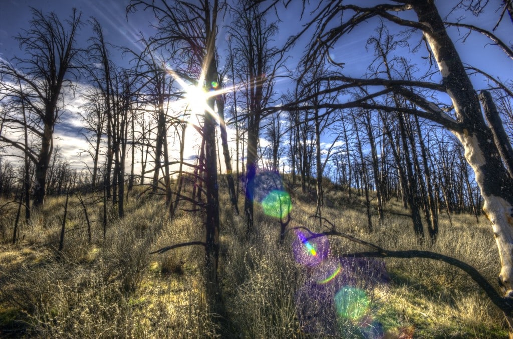
Since photography is light, being a good connoisseur of it and knowing how to play with it is essential when photographing any scene. Here "almost anything goes" you can overexpose, underexpose, play with backlighting , with the sun's rays... You don't always have to look for the "correct" image, let yourself go, put the camera in manual, remove the lens hood and watch how the sun's rays sun create interesting effects in your image. Do you know the dreaded 'flares'? Those circles of light that appear in your images when the light hits your optics directly?
Look at the following images. Both have been made facing the sun, taking advantage of the effects caused by direct light in the optics.
CREATIVE PHOTOGRAPHIC 'MISTAKES' WITH TEXTURES: NOISE
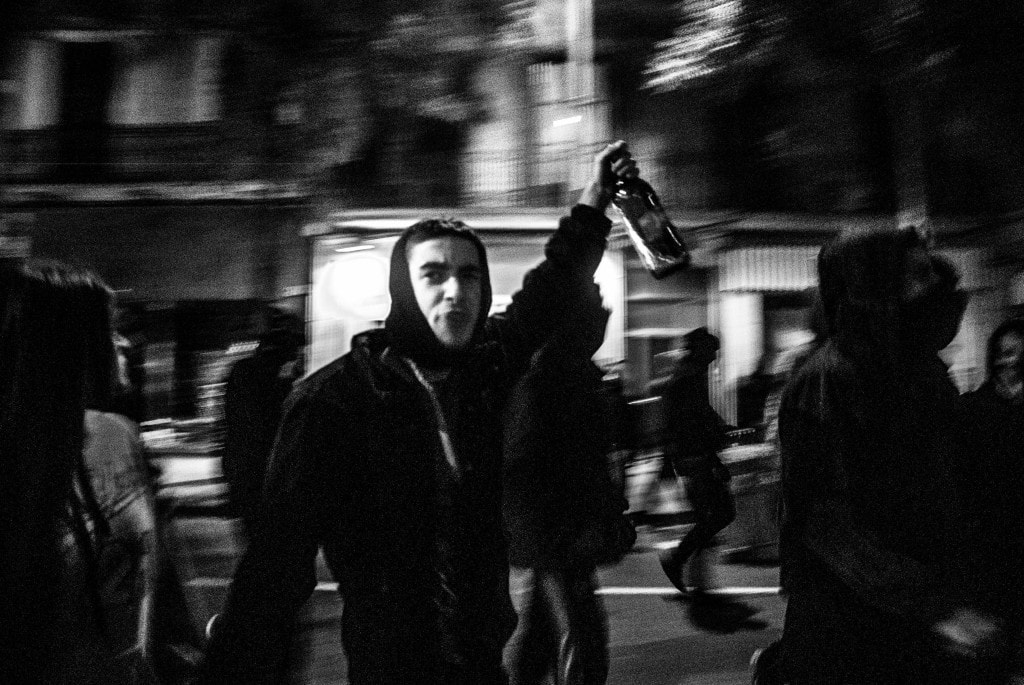
Noise is closely associated with the ISO you are using when capturing your image. The higher the ISO, the more noise and vice versa. Iaio explains it beautifully here. As a photographer and in the world of photography in general, we are always looking for clarity when we want to get closer to explaining reality as we see it; The noise in our images at night bothers us, we look for the best lenses and the best cameras... But noise is an intrinsic part of photography, in fact, the big photographic brands 'fight' to have the most 'beautiful' noise; the most similar to the grain that the reels gave us. Because noise or grain are not always annoying, noise enhances the old, the passage of time, the night, the dark, it is more intimate and generates sensations that a perfectly clear photograph cannot do.
CREATIVE PHOTOGRAPHIC 'MISTAKES' WITH MOVEMENT
Movement is one of the easiest ways to add vitality to an image, and to technically achieve it, it is enough to play with low speeds, (lowering the ISO, closing the diaphragm, or simply in low light scenarios...) with a tripod (or with a good hand) and moving subjects. You can use multiple techniques to get movement; you can print movement only to the background through the scans, you can use the zoom to create interesting games of movement, etc. If you want to delve into it, you can't miss this article that contains everything you need to know about movement.
At this point you will have seen that there are many and very interesting ways to break the rules in photography. Think for a moment what would have happened if no one had ever dared to break the rules. Where would Van Gogh, Dalí, Picasso, Frida Kahlo, Botero and so many other unforgettable artists be today? Perhaps you think that all of them are simply united by their originality and genius, which is true, but beyond that, they are united by the fact that they all perfectly mastered the technique (in this case pictorial) and that thanks to it, they developed their talent and took it further, creating a new and original language.
So, once the technique is part of you, let yourself go, innovate, and if you like what you do and feel comfortable, defend it. Never stop learning and trying new things, and above all, feel what you do, you don't just have to think when you take pictures, you have to feel them, and the more you do, the more you will know yourself and the closer you will be to finding what you are looking for ?
And if the article has been useful to you, you know, share it with your friends. Thank you so much!

