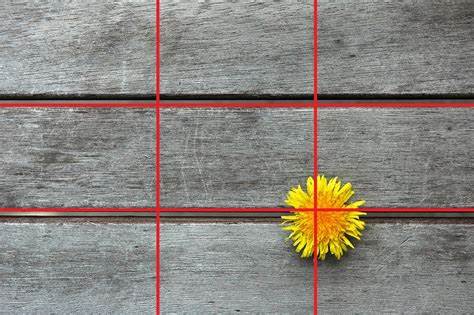
Who more who less has heard of the rule of thirds. Not surprisingly, this composition rule is one of the most applied in photography. Now, do you know what it consists of? Do you know how to use it or what is its origin? In the following lines I will give you all the information you need to apply it successfully in your compositions, but if you want to delve into photographic composition and learn all the tips and tricks for some of the most impressive photographs, take a look at this mega guide that we have prepared you

ORIGIN OF THE RULE OF THIRDS
The rule of thirds comes to be the simplification of the proportions of the golden section, based on the harmony that govern certain patterns of nature such as leaves, snails, or other natural forms.

The golden ratio is based on an irrational algebraic number resulting from linking two segments of a line. Its decimal representation is infinite and has no period, even mystical properties are associated with it, linked to the perfection of its proportions.

The golden ratio has been used over the years by different advanced cultures to compose and design from paintings, sculptures or monuments.
The rule of thirds is inspired by the golden ratio and is one of the most widely used composition rules in photography and in general in other visual arts such as painting or film. It mainly serves us to order the objects within the frame.
WHAT IS THE RULE OF THIRDS?
This rule is based on the idea that in the image there are certain areas where we direct our gaze naturally. We call these areas “strong points”.
The strengths of an image come from dividing the rectangular scene into two horizontal and two vertical lines as shown below:
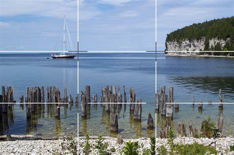
The point where the vertical and horizontal lines intersect is the strong point of photography, where our gaze naturally goes.
And it is in those strong points of the scene that you should place your main subject. This will naturally add interest and guide the viewer's gaze.
HOW TO APPLY IT
Most cameras and editing programs have a grid that represents the lines of the rule of thirds. To familiarize yourself with it, you can have it activated for a while until you get used to this type of compositions.
The rule of thirds can be applied to any type of photography, but where it is usually most common to see it is in portraits, product or landscape photography, among others.
IN PORTRAITS
There is no single way to compose a portrait, far from it, even based solely on the rule of thirds. You will also have to decide where you want the image to "breathe", etc.
- If you work with a close-up like the one in the example, what we usually place in the strong point of the frame is the look.

- If you're working with wider shots, try to place the entire subject in one of the strong points.
- The rule of thirds in portraiture is usually combined with the law of the gaze, which seeks to give air or space to the scene in the place where the gaze is directed.
IN LANDSCAPES
Landscapes are a compositional challenge, because it is not always easy to capture the beauty of a landscape in a two-dimensional image. To help us achieve this, we have to do it through composition.
- The rule of thirds will help you stop the viewer's gaze somewhere in your image and prevent their gaze from wandering aimlessly to the rest of the image.
- It can also help you add three-dimensionality to your scene, if you place the point of interest closer to your target.
- It is also usually combined in some cases with the law of the horizon (which says that you have to occupy 2/3 of the image with what interests you to highlight more: sky or earth)

IN PRODUCT PHOTOGRAPHY
In this type of images where the composition can be applied with time and therefore it is required that it be meditated, this type of composition gives good results. In product photography, without a doubt, it is used a lot.
- You can combine it with negative space .
- Combine it with a good color job.
IMAGES BASED ON THE RULE OF THIRDS
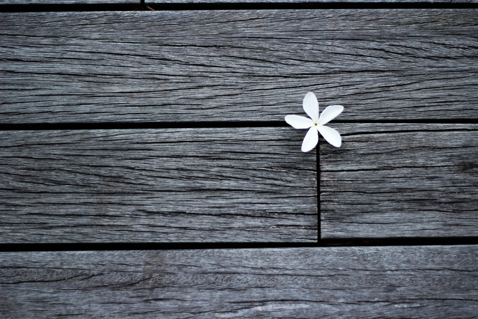
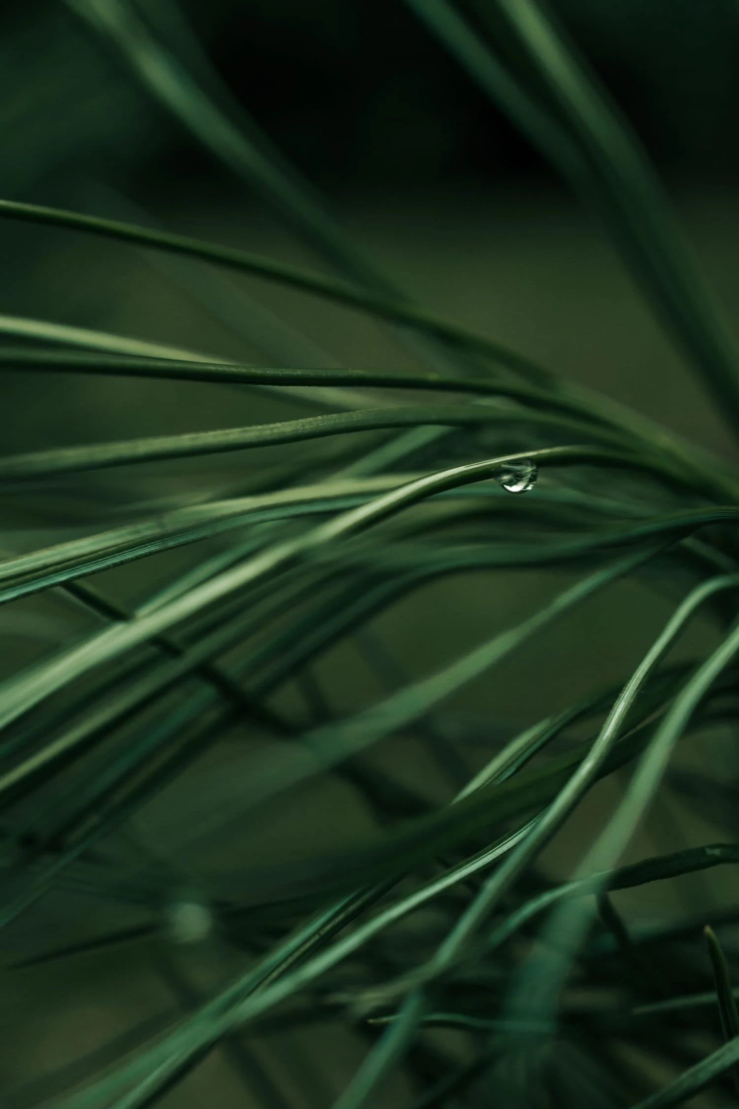
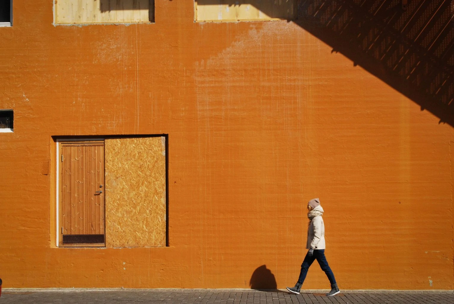
If you expand them one by one, you will see that all of them are based on the rule of thirds. As you will see, it can be applied both vertically and horizontally and to different types of images.



DRAWBACKS
If everything were so easy, right? Well, the truth is that, like everything, what is repeated is boring, it's that simple.
My main advice is that it should not be abused, especially when the composition is very simple. In these cases this rule is very noticeable and surprises us little. An image should never be based (in my opinion) on a single compositional decision, which can also be a mistake.
Let me explain, if an image is very simple visually, the element that appears has little interest, and it is only composed because it is located in the strong point, it is a bland image.
On the other hand, if you combine different elements of compositional interest, such as an image with an interesting imbalance, a surprising point of view, some attractive colors, a symmetry, a natural framing, a shadow or a fascinating protagonist... this rule can work for you very good.

What do you think? Did you already apply it to your images? It is one of the most used rules and it is no coincidence, when applied it works very well, so now you know, tinker with it, make the most of it and discard it when necessary ?

