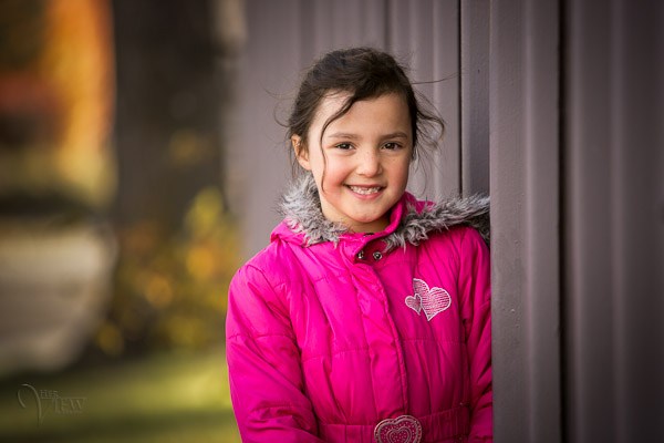
WEEKLY CHALLENGE 135: PORTRAIT WITH DEFOCUSED BACKGROUND

WEEKLY CHALLENGE 135: PORTRAIT WITH DEFOCUSED BACKGROUND

This week I propose to practice with depth of field when making a portrait, something essential to achieve greater impact.

HOW DOES IT WORK? (REMINDER)

Every week I will propose a new challenge , it is a subject that you will have to capture in a photograph and upload it to the Facebook page of the blog, putting in the description the key word that I will indicate for each topic. The themes will be varied, from portraits to Macro photography, through landscapes, black and white photography, or babies. The topics will be proposed on Fridays , so that you have all the weekend to work them. You will have the deadline to upload your photo one week (one photo per participant), until Thursday of the following week. On Thursday I will update the article with the photo that has captivated me the most and on Friday I will propose a new theme so that you have the whole weekend to capture your images, and so on ...

WEEKLY CHALLENGE 135: PORTRAIT WITH DEFOCUSED FUND (FROM 11/13/2015 TO 11/19/2015)

There is an easy, very easy trick for your portraits to win in impact, and it is to play with depth of field. If you use a wide opening , you isolate the model from the background and directly focus the viewer's attention on it. Like when you fall in love at first sight that it seems that suddenly everything that is around disappears ... well, something like that. You can use a very wide aperture, so much that only a focused part of the face appears, or only blur the background. You decide that. In the first case you must be careful with the look, it is the key. Unless it is a creative exception (and carefully studied), the eyes, or at least the closest eye, must be well focused or your portrait will not succeed. If you need some help with portrait photography, here are a few items that can help you. Let yourself be trapped by the world of portraiture and seduce us with yours As usual, to participate in this week's challenge, upload your photo  to the Facebook wall of the Photographer's Blog:  In the description of the photo please mention the keyword  “Challenge Portrait with Defocused Background”  followed by a title of your choice .

ALTERNATIVE MEANS TO PARTICIPATE

For those who are not from Facebook I have enabled new social networks to participate.
  • Flickr:  accessing the  Group Mural of the Photographer's Blog  and uploading the photo directly. Give your photo a title and be sure to mention  “ Portrait Challenge with Defocused Background ” in it.
  • Twitter:  uploading the photo directly to Twitter with the hashtag  #Reto PortraitconFondoDesfocused BdF
Happy photography

UPGRADE

What a level, every time you curry more and you encourage more people, huh? Impossible to put all the portraits that I liked, here there is only a small sample (although this time I have been a bit extensive ), if you want more to go through the galleries of Flickr, Facebook or Twitter A photograph must be consistent with itself, it is the best way to be honest with your audience as well as to get their attention. At least that's what happened to me with "Soledad" by Rigoletto Reséndez. I don't know if the title is the name of the person portrayed, the feeling you want to convey or an intentional pun. Whatever it is, it cannot be more successful because that is exactly what the woman transmits and everything that makes up the image. Indeed, the retro tried to blur the background in order to focus attention on the gaze, on the person portrayed and that is what happens here. The background blur (and foreground) focus all attention on it, in its penetrating, lonely look. It transmits a loneliness that seems not to be sought, that anguish but that at the same time gives the feeling that it has settled, or that he fears detachment from her. I also like this portrait very much because of its timelessness, the place, the hairstyle, the blouse, the bracelet, they can be now or thirty or even fifty years ago. The colors, the light, the gesture, the look, the posture and even the blurred background harmonize and collude to convey the same message and captivate the viewer. At least he left me a few moments looking at him and asked me to come back several times. I've had the feeling of being hypnotized by the look of loneliness, or should I say about Soledad? Congratulations to Rigoletto and all who have participated! the posture and even the blurred background harmonize and collude to convey the same message and captivate the viewer. At least he left me a few moments looking at him and asked me to come back several times. I've had the feeling of being hypnotized by the look of loneliness, or should I say about Soledad? Congratulations to Rigoletto and all who have participated! the posture and even the blurred background harmonize and collude to convey the same message and captivate the viewer. At least he left me a few moments looking at him and asked me to come back several times. I've had the feeling of being hypnotized by the look of loneliness, or should I say about Soledad? Congratulations to Rigoletto and all who have participated!

Leave a Reply