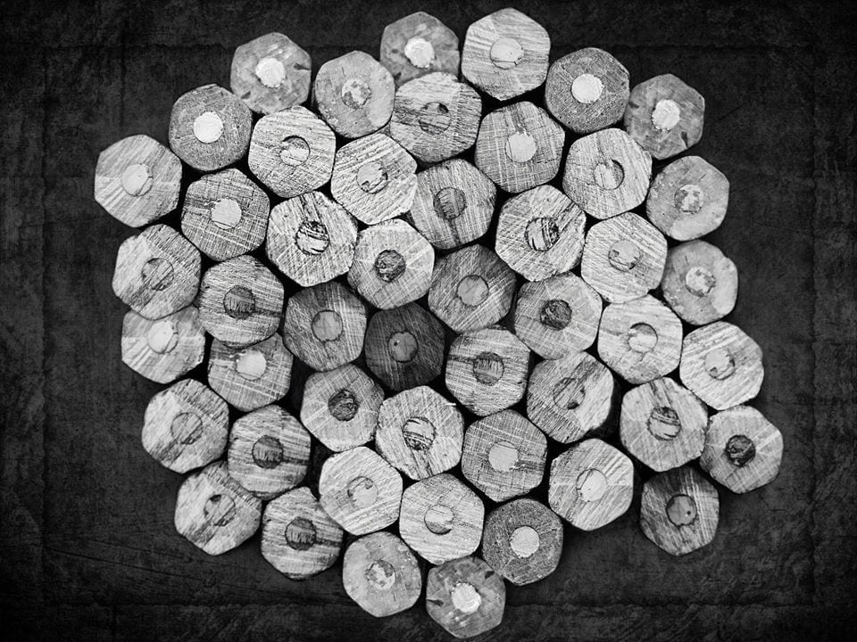
What is this? This word that seems so complicated is nothing more than photographing repeated elements. Easy, right? So are you in? This time I won't take no for an answer, there are no excuses ?
HOW DOES IT WORK? (REMINDER)
Every week I will propose a new challenge , it is a topic that you will have to capture in a photograph and upload it to the Facebook page of the blog, putting in the description the keyword that I will indicate for each topic. The themes will be varied, from portraits to Macro photography, going through landscapes, black and white photography, or babies. The topics will be proposed on Fridays , so that you have the whole weekend to work on them. You will have one week to upload your photograph (one photo per participant), until Thursdayof the following week. On Thursday I will update the article with the photo that has captivated me the most and on Friday I will propose a new topic so that you have the whole weekend to capture your images, and so on…
WEEKLY CHALLENGE 149: PATTERN EFFECT (FROM 03/04/2016 TO 03/10/2016)
The Pattern effect, as much as it sounds like complicated terminology, is nothing more than photographing a series of repeated elements to create textures or give rhythm to the image. That's why this week we dedicate the challenge to it, because terminology often throws us back when it shouldn't.
Find your camera and find a repeating motif. It won't cost you much, around you you will find dozens, or hundreds if you are in an open space. They can be large motifs or small details. And, since we are not asking you for something too complicated, pay close attention to the composition , create a rhythm , tell us a story through these repetitions or achieve an image with a lot of visual force: your goal is to attract all eyes. You have the tools, now show what you're worth! ?
As usual, to participate in this week's challenge upload your photo to the Facebook wallfrom the Photographer's Blog: In the photo description please mention the keyword “Pattern Effect Challenge” followed by a title of your choice .
ALTERNATIVE MEANS TO PARTICIPATE
For those of you who are not from Facebook, I have enabled new social networks to participate.
Happy photography.
UPDATE

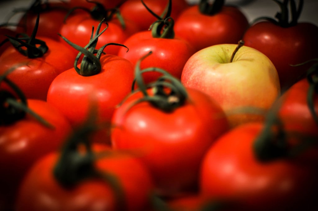
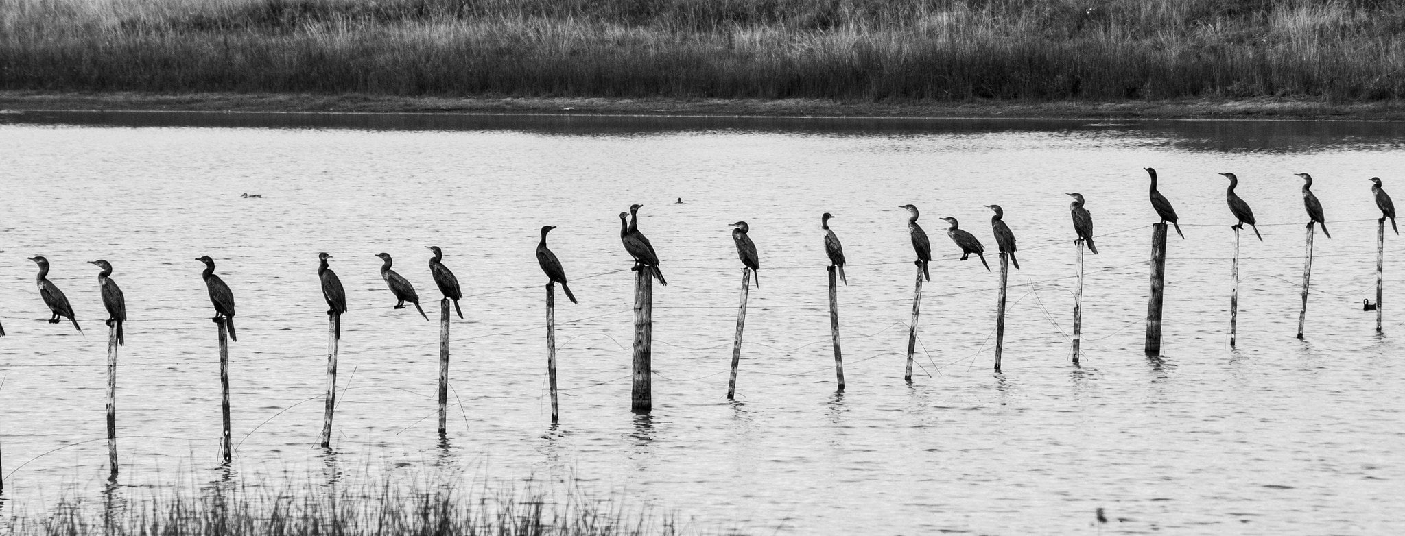
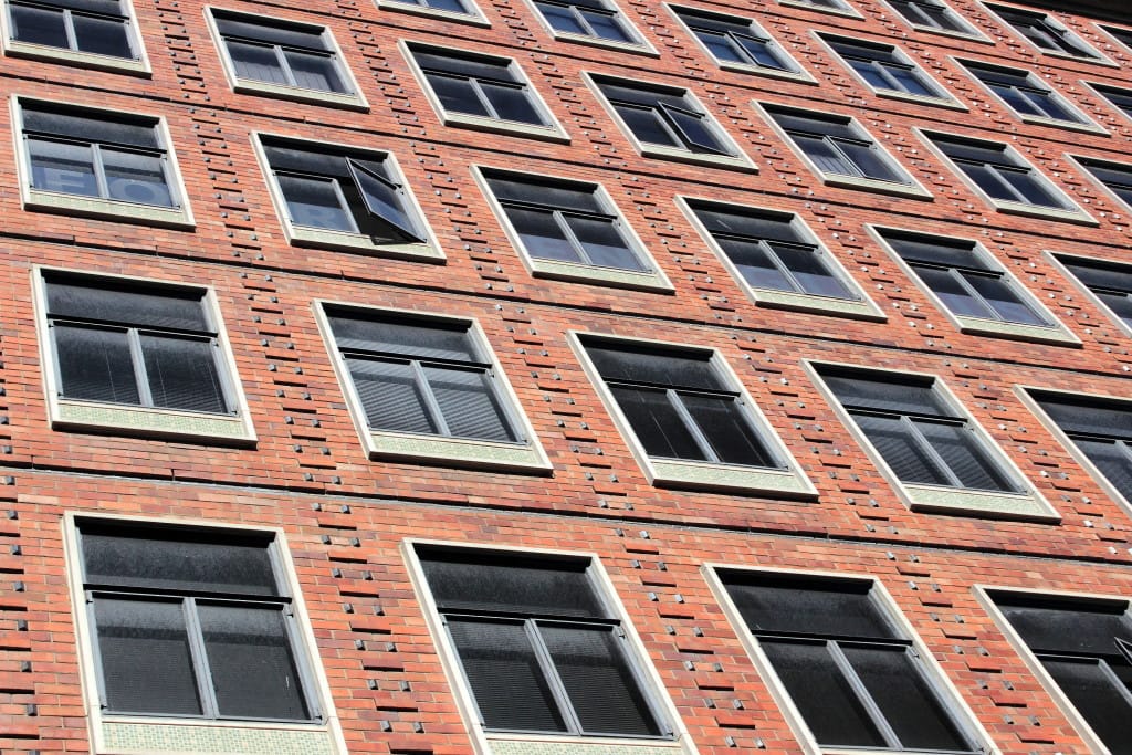
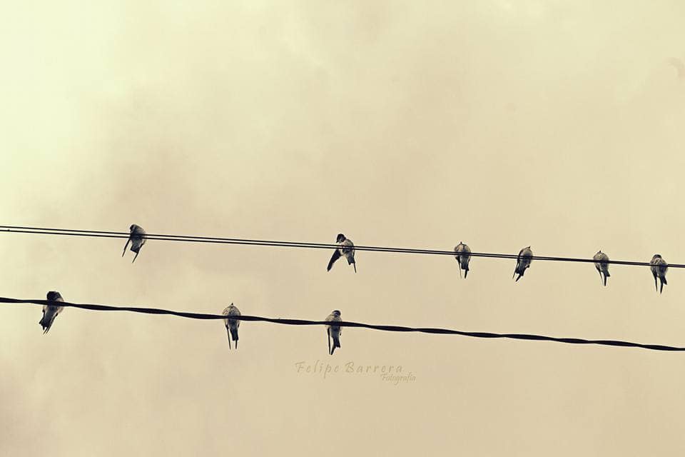

And here you have the expected weekly summary of the photos sent. Thanks for participating!
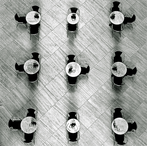
Today is one of those days when I have had serious doubts between two photos, in the end the balance has to tip and I suppose that my weakness for black and white and for the square format have had a lot to do with the decision... that's what What happens with subjective selections ? This week's featured photo is eMecHe's, titled “Delirium on a travertine marble background”. If the black and white treatment is fantastic, the composition is brutal. EMech has cleverly shot from an overhead angle and has used the best format that, in my opinion, he could have chosen for this composition. A square of tables within another square. Elements that are repeated and that form an almost perfect symmetry, but it is that "almost" that gives the image its appeal. If it were a perfect symmetry it would be boring and it wouldn't be such a perfect photo ? I love the game of lines, on the one hand the diagonals of the floor, those of the joints in one direction, those of the marble drawing in another; and these in turn contrast with the horizontal and vertical ones that form the tables. As I said, a very ingenious photo. Very well seen eMeche, congratulations!

