In this article I am going to talk about the chromatic circle and how it can help you in your photographs. But not only in photography, for any other trade this article will help you. Knowing the color wheel and color theory is essential in design, graphic design, fashion, cinema, painting, cooking, advertising, decoration, marketing and sales and a long etcetera.
I am going to explain what the color circle is, what are analogous, complementary, cold, warm, primary, secondary colors and everything related to this wheel. In addition, I will tell you how the colors interact with each other, what the different combinations transmit and what that color psychology thing you have ever heard means.
In this way, you will understand how color influences your work and you will have the opportunity to improve it in a very simple way.
Although it may seem somewhat confusing, I promise to explain it to you in the simplest way possible and get to the point.
- What is the chromatic circle?
- What are the primary colors?
- What are the secondary colors?
- What are the tertiary colors?
- What are analogous colors?
- What are complementary colors?
- Other Color Wheel Combinations
- cold and warm colors
- color proportions
- Color psychology
- Notes on photography and color
- Practical exercise
Before continuing, if what you are looking for is to improve your photographic compositions, I recommend our mega guide on photographic composition full of essential tips and tricks .
WHAT IS THE CHROMATIC CIRCLE?
The color wheel is an ordered graphical representation of colors in the shape of a circle. It segments the colors based on their tone or hue and captures the primary colors and their derivatives: secondary and tertiary colors. It is also known as the chromatic or color wheel.
There are different color wheels and it is not something new, Newton and Goethe, among others, already worked with them in their day. In fact, Leon Battista Alberti already in 1436 created a wheel with what were the four primary colors of his time: red, blue, green and yellow.
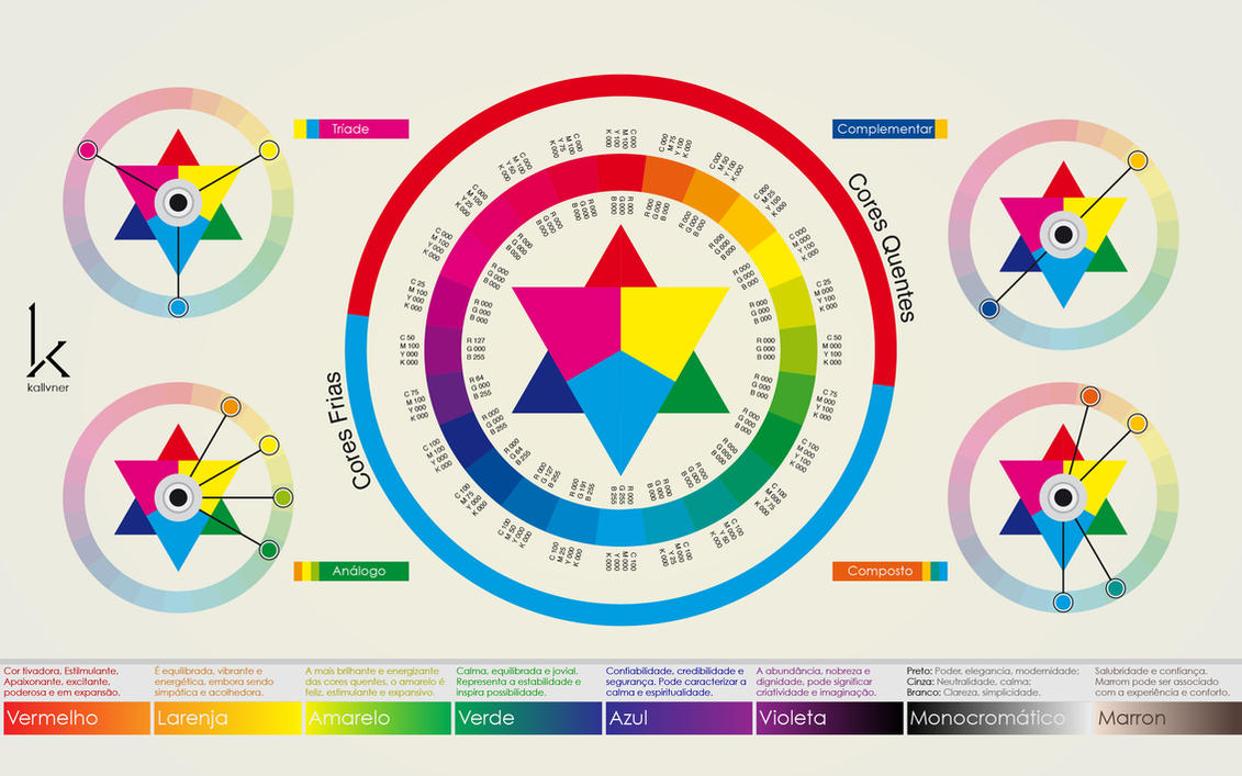
The basic color wheel is the one that consists of 12 colors, like the one in the following graphic, although you can find them with many more colors, shapes, and gradients.

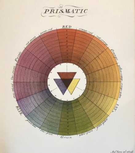
Next, we have a complete color wheel of 18 colors with their gradients, it is the color wheel of Moses Harrisof the s. XVIII.
By the way, if you want to see this information very summarized at a glance, do not miss our infographic on color in photography .
WHAT ARE THE PRIMARY COLORS OF THE COLOR WHEEL?
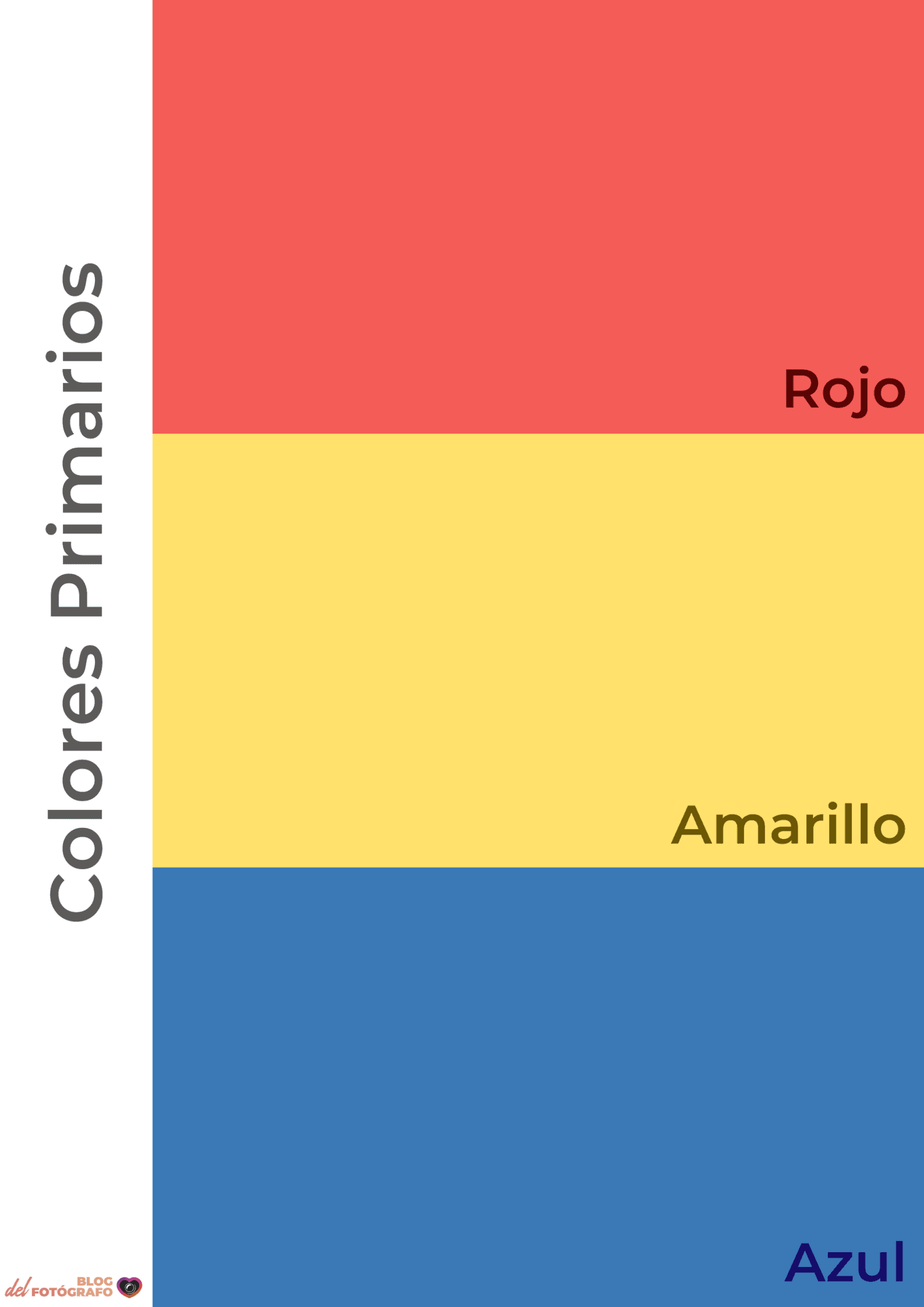
The primary colors of the color wheel are those that cannot be obtained by mixing any other color. They are red , yellow and blue and are equidistant on the color wheel.
WHAT ARE THE SECONDARY COLORS OF THE COLOR WHEEL?
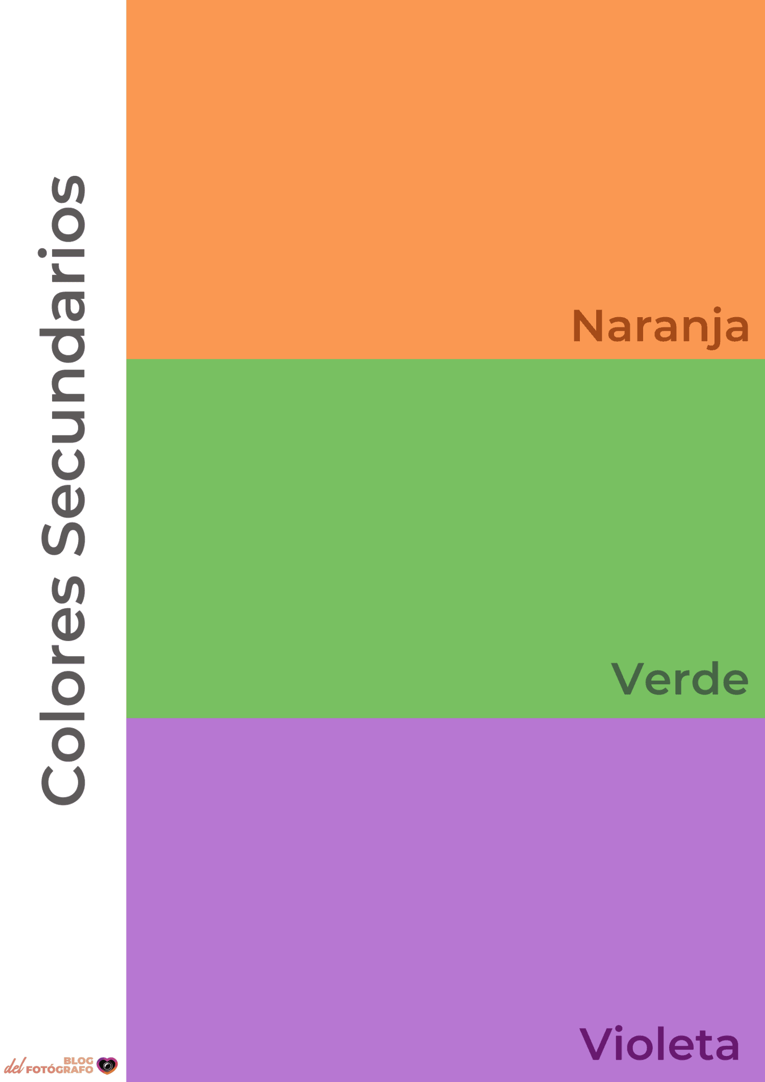
The secondary colors of the chromatic circle are those that arise from the mixture, in a 1:1 ratio, of the primary colors: green , orange and violet .
- green: yellow + blue
- orange: red + yellow
- violet: red + blue
WHAT ARE THE TERTIARY COLORS OF THE CHROMATIC WHEEL?
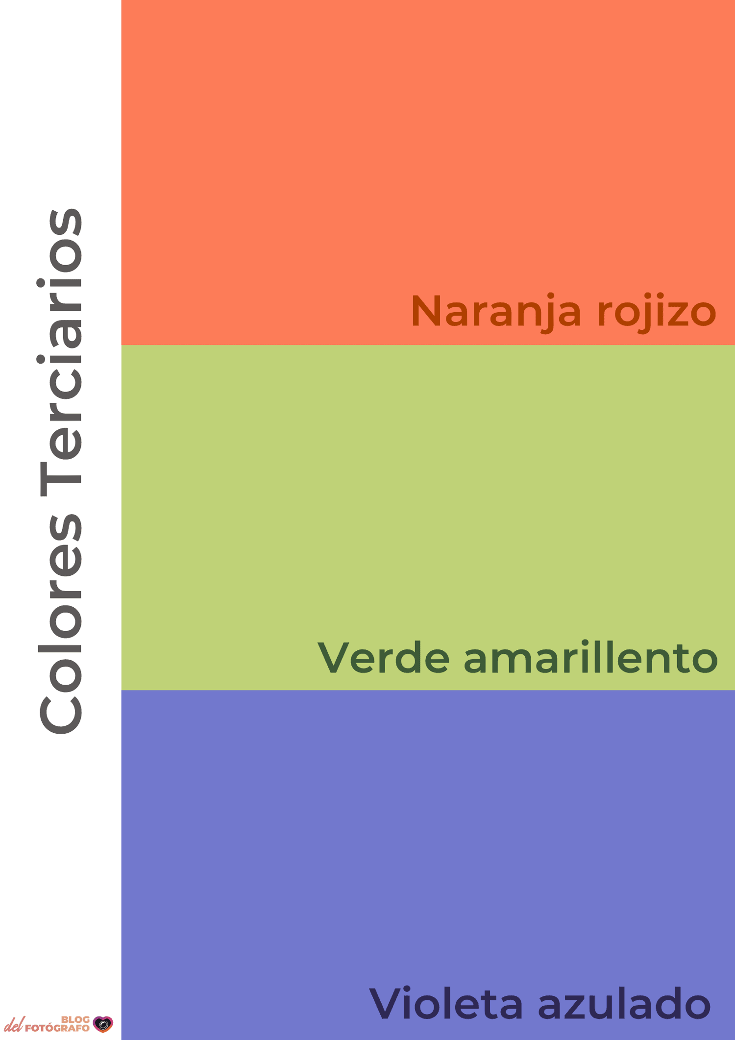
Tertiary colors are those that result from mixing a primary color with a secondary color, such as bluish violet.
WHAT ARE ANALOGOUS COLORS?
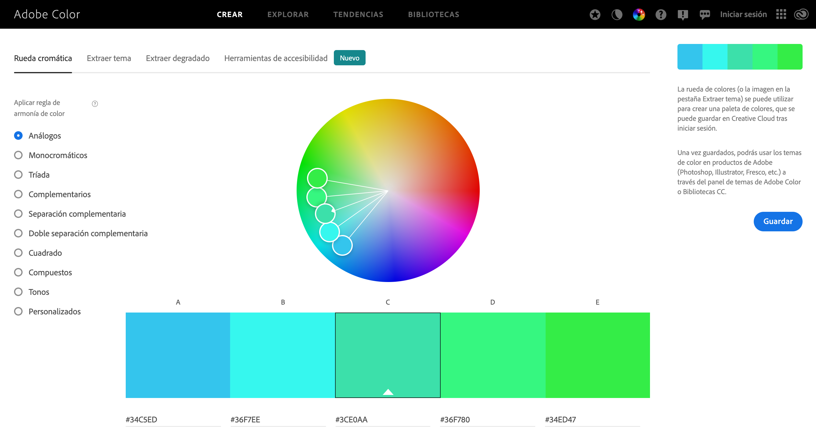
Analogous colors are those that are in contiguous positions on the color wheel. Their combination is very pleasing to the eye because they reflect similar light waves. The harmony between similar colors is very evident and with them environments are created that convey calm and balance.
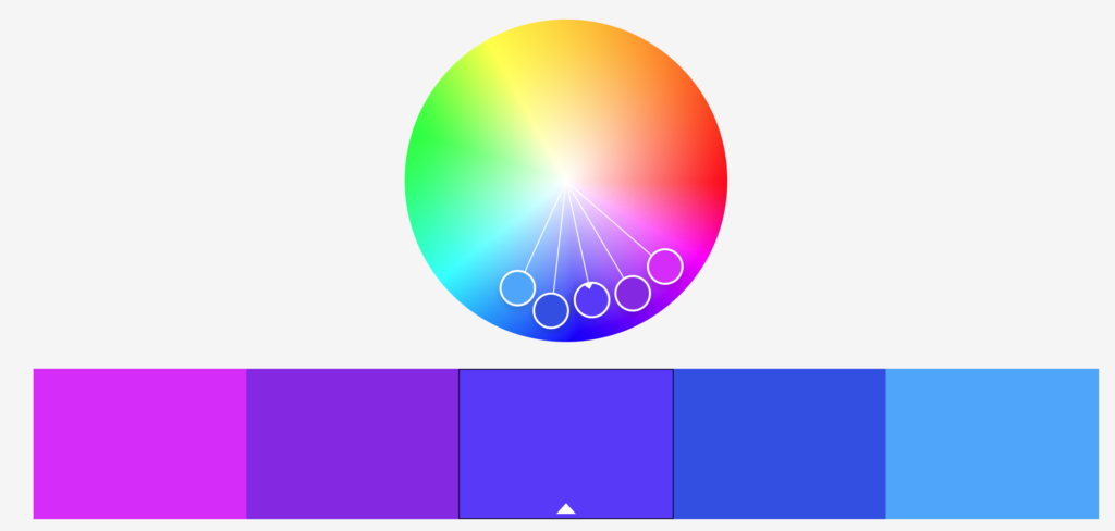
Analogous color combinations are usually limited to three, or at most up to five contiguous colors.
WHAT ARE COMPLEMENTARY COLORS?
Complementary colors are those that are in opposite positions on the color wheel: red and green, blue and orange, or yellow and violet.
The harmony by the complementary colors is based on the contrast and on the effect that it causes, in addition, in reality, the mixture of two opposites in the circle gives rise to a neutral. But keep in mind that using the contrast of complementary visually works very well.

OTHER COLOR WHEEL COMBINATIONS
In addition to analogous and complementary colors, we find other color combinations within the chromatic circle:
COLOR TRIADS
Triads are the combinations formed by the colors arranged at the vertices of an equilateral triangle within the chromatic circle. It is another way to achieve a harmonic sensation.
The ideal is to choose a dominant color, another that supports and a last one that acts as a contrast. Or a dominant color and two others that accompany it.
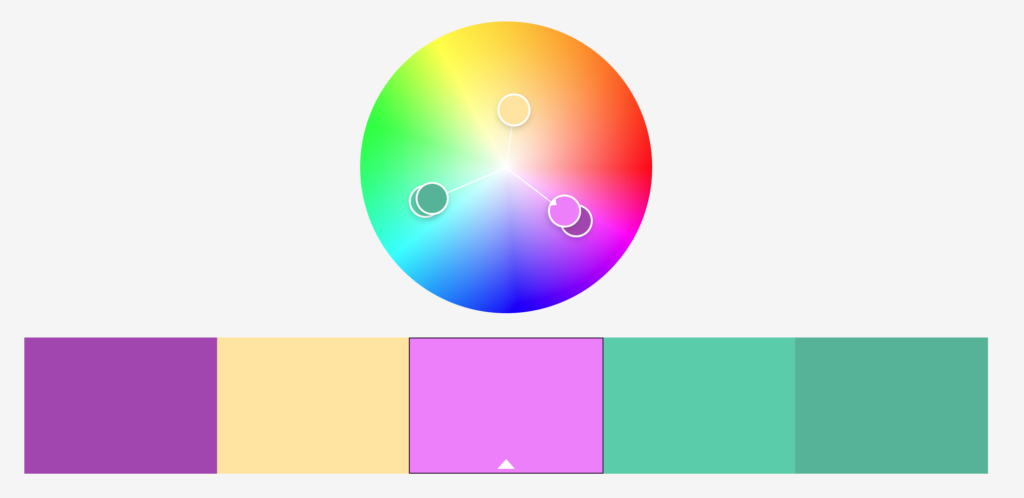
This three-color combination is similar to the one depicted in this photograph. The dominant one would be violet, green as sustenance and golden yellow to contrast.


QUADRANGLE
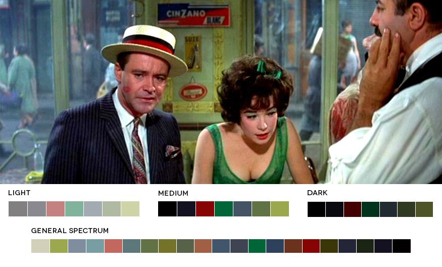
A quadrangle is the combination of colors formed by those that are in the corners of a square within a color wheel. It is also known as tetradic scheme. It is another combination that creates contrast within a visual order and harmony.
Take a look at this example from the world of cinema taken from the magazine Fotogramas:
MONOCHROME
Another option that we should not forget is monochrome, which although we associate it with black and white, in reality monochrome is a single color. That is, include in the frame a single color or shade with different tints or shades.
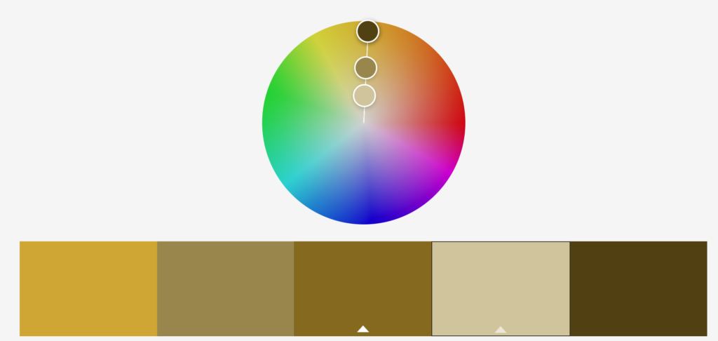
The following image is a good example of monochrome photography.
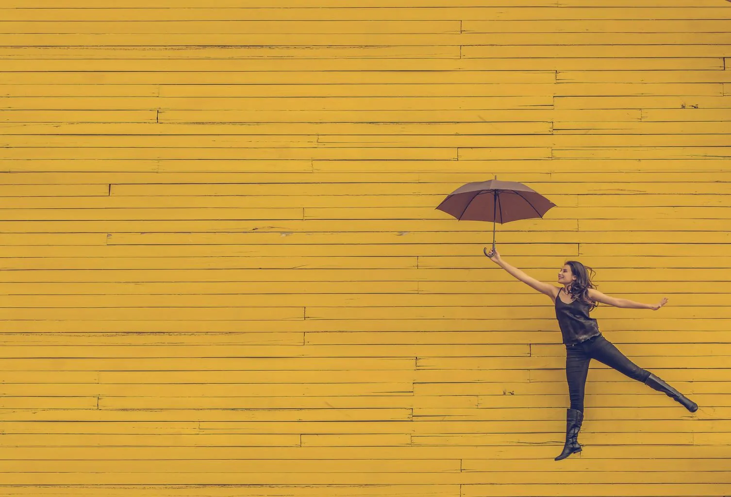
To help you combine all these colors on the color wheel, there is a free tool from Adobewhich works very well. You select what type of combination you want and you move the wheel to select the colors. You can also choose a theme color and, from there, create different combinations.
COLD AND WARM COLORS
The denomination of colors between cold and warm is due to an artistic and psychological classification based on what reasons we associate with certain colors.
Some colors can be considered cold or warm depending on whether they have a greater proportion of a warm or cold color, for example, bluish green is considered cold and yellowish green is considered warm.
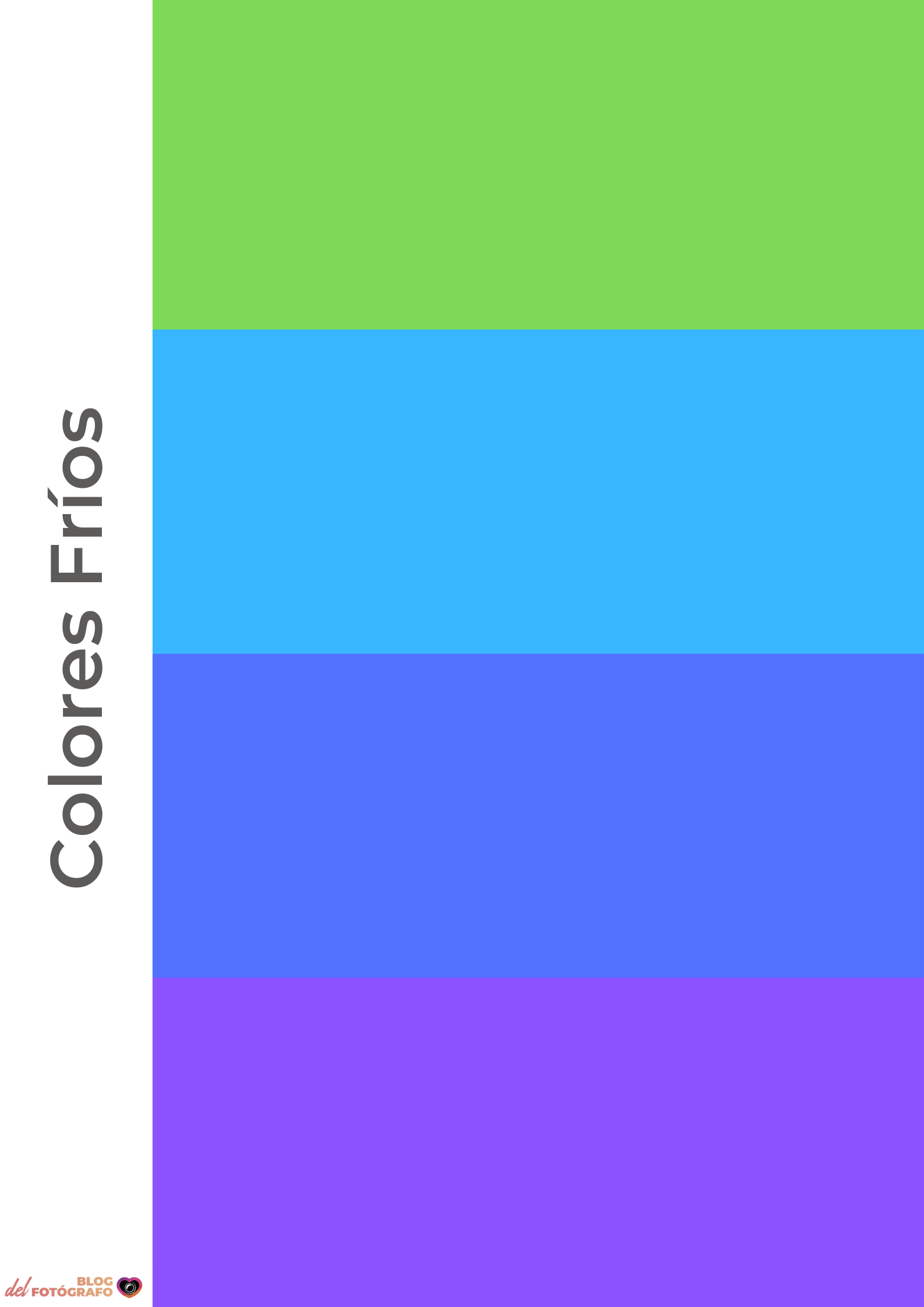
WHAT ARE COOL COLORS?
Cold colors are those that include blue, and are associated with the sky and the sea: blue, turquoise, green, violet, etc. They are usually to the left of the color wheel.
WHAT ARE WARM COLORS?
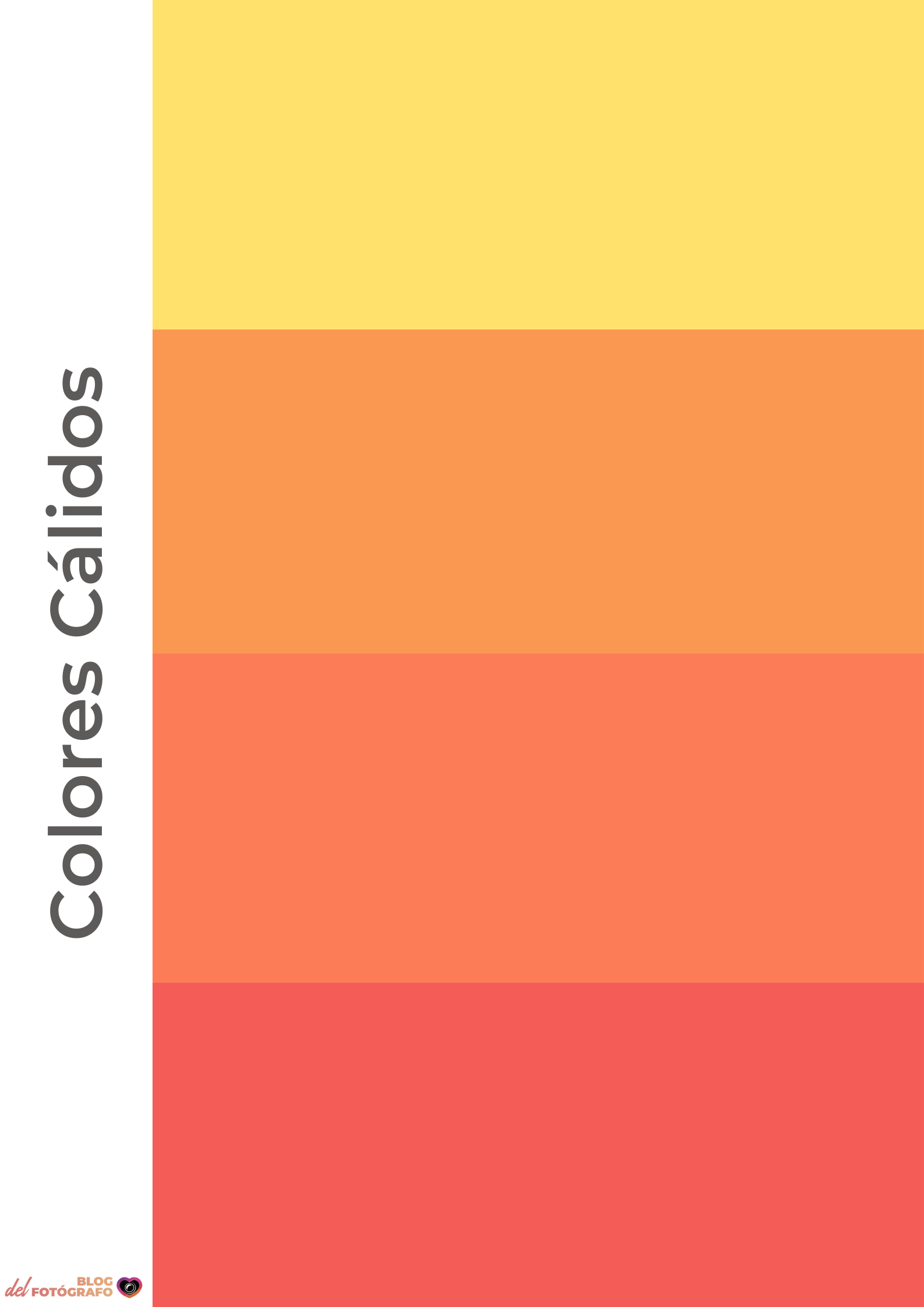
The warm colors are those that contain red in their composition, they are associated with fire and the sun and are yellow, orange, red, brown, gold, etc.
They are generally represented to the right of the color wheel.
COLOR PROPORTIONS
Colors harmonize best when there is a balance of weights , that is, when their areas are inversely proportional to their relative brightness. This is, for example, that since green and red are equally bright, they harmonize better when their proportion is 1:1, or what is the same, they have the same presence in the image.
On the other hand, since orange is twice as bright as blue, the ideal ratio should be 1:2 (orange:blue).

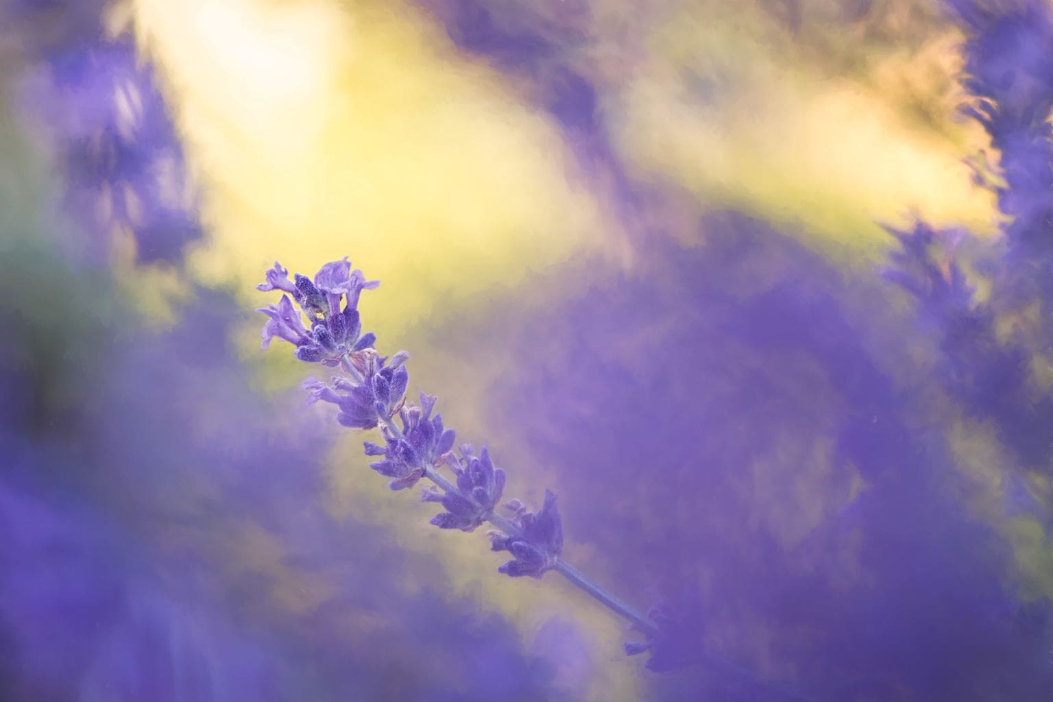
In the case of yellow and purple, since they are at the two extremes of brightness, the best combination is 1:3. Let's see an example:
COLOR PSYCHOLOGY
We have talked about the color wheel and how the colors of the color wheel are related to each other, now we enter a more emotional aspect.
WHAT IS COLOR PSYCHOLOGY?
Color psychology is a field of study within behavioral psychology that analyzes how we perceive colors, how we behave in front of them and what emotions they arouse in us. Science affirms that each color clearly influences our state of mind and also our mental state.
Each color arouses a type of emotion in us, from joy to sadness through irritability.
It is also important to keep in mind that a color can vary its meaning or its impact on emotions depending on the culture.
Believe it or not, we apply the psychology of color in our daily lives, for example, when choosing the clothes that we are going to wear or when deciding what color to paint a room in the house.
Companies also take it very seriously. Advertising, designers or salespeople, for example, are very aware of the effects of color on us and use it very, very well.
Cinema is another clear example. In the event that you are a very cinephile person, you will have already realized how color can direct a scene or even an entire movie. If you're curious to see what palettes they've used in certain movies, you can check out @CINEMAPALETTES ' posts on Twitter. .
Let's see what impact each of the colors has on us, which will help you when composing your photos or using it in your work. You have the power to arouse emotions simply by choosing the colors of the chromatic circle well, are you going to waste it?
MEANING OF COLORS ACCORDING TO COLOR PSYCHOLOGY
We are going to see in more detail what each of the main colors of the chromatic wheel and the neutrals (white, black and gray) mean.
YELLOW
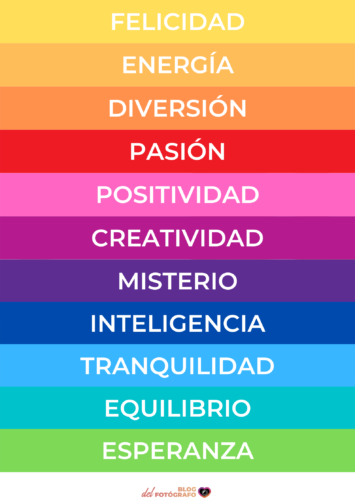
It is so bright that there is no dark version of this color. It transmits verve, joy, happiness, optimism, speed and kindness.
In its negative part, aggressiveness, fear, jealousy and envy.
When combined with black, it contrasts very well, but on the other hand, it indicates a certain sign of danger (in fact, it is the combination used to indicate toxic or explosive substances).
ORANGE
It is associated with youth, parties, energy, celebrations and fun.
It is also suitable for transmitting dryness and evoking heat; associated with frustration or immaturity.
RED
It is the most energetic and exciting color. It conveys passion, action and movement, daring, masculinity, importance and strength.
In the foreground it emphasizes the sensation of depth because it tends to move forward.
It also evokes aggression, risk, challenge.
GREEN
All its positive symbolisms come from the fact that it is the most present color in nature. It is associated with organic, progress, hope, awareness, harmony, peace, vigor and rejuvenation.
In its negative form it is related to illness, decomposition or boredom.
BLUE
It is the coldest color and is associated with calm and rest, also with freshness, lightness, intelligence, serenity, efficiency, reflection.
If you wear something yellow or red it becomes warmer (remember sunrises and sunsets).
It is a color that is associated with security and trust, which is why many health companies use it.
On its negative side, it can awaken coldness or distance (also emotional).
VIOLET
The complementary of yellow is a difficult color to find and very easily confused with purple.
It is associated with wealth and sumptuousness, mystery and immensity, while purple is more associated with religions, power and violence.
WHITE
With white you will be evoking innocence, purity, cleanliness, simplicity, kindness, love, space, etc. Be careful that on its negative side it is associated with coldness or antipathy.
BLACK
It evokes elegance, sophistication and power. On its negative side it is reminiscent of sadness, oppression, threat or bad luck, as well as being associated with death.
GRAY
It is a neutral color that is perceived darker or lighter depending on what colors surround it. It evokes indifference and insecurity.
Keep in mind that colors are perceived differently depending on what other colors are nearby. A yellow color will never transmit the same thing nor will it be perceived in the same way if it is accompanied by orange as if it is next to black.
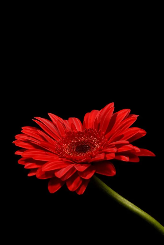
Let's see an example with two red plants, but with different backgrounds, what does one transmit to you and what does the other transmit to you?

LAST NOTES ON PHOTOGRAPHY AND COLOR
Now that you know how to create harmony with the combinations of the chromatic circle, in addition to knowing the emotional implications of the different colors, I am going to leave you some more notes so that you can master color in your creations:
- Color distracts because of its power of communication, so the more colors you include, the more difficult it will be for you to maintain balance or harmony, and the more they will lose the message. At most it includes four colors.
- It is very effective to combine a dominant color with its complementary within the color wheel.
- You can also play with contrast by introducing a warm color into a scene with cold colors, or vice versa.
- Placing a warm color in the foreground is interpreted as proximity. Cold colors, on the other hand, seem to recede.
- Red is a color with a strong appeal, as long as you include it in the frame it will capture a lot of attention.
- To add depth, place a warm color in the foreground, neutrals in the middle, and blue or white in the background.
EXERCISE ON THE CHROMATIC CIRCLE
Before saying goodbye, I leave you with a series of photographs so that you can look at them and try to find out what color wheel combinations have been used and if they are cold colors or warm colors (or both in contrast).


And here is today's article on the chromatic circle. I hope you have found it useful and that, next time, before composing a photo or combining colors, you take all this information into account.

