
Before you begin to get acquainted with color correction, it is worth clarifying that this topic is very extensive. To engage in color correction at the proper level, it is better to take special courses where you will be taught the basics of color harmony, learn how to correctly combine colors and use existing methods and methods of color correction. And it is advisable to get a certificate. In the digital age, photo processing is a very lucrative business. And the most profitable investment at all times was and remains education. We will consider the basic universal method of color correction. Before you make color grading in Photoshop, you need to understand what it is and for what purpose it is used. Color correction is a change in the colors, tones and saturation of an image, used either to improve the picture, or as a creative technique. The first case includes the need to get more realistic colors or make the photo brighter. Indeed, at certain settings of photographic equipment, colors can be distorted, not like we see them in real life. This also includes correction of the photo to increase the saturation of colors, for the sake of greater attractiveness of the picture. In the second case, color correction will tell you your own imagination. It can be vintage color correction, fantastic colors of landscapes and the like. Color correction in Photoshop is carried out on adjustment layers. If color correction is applied to the image layer, the image changes will be irreversible. Adjustment layers work like filters. All effects of the adjustment layer will be visible in the image below this layer. Also, the adjustment layer will allow you to make changes to the final result, if necessary. We discussed the topic of layers in a previous article.
Automatic color correction
The easiest and fastest way for beginners is automatic color correction. Open the image in Photoshop, duplicate the image layer ( Ctrl + G ). Go to duplicate the layer and press the Shift + the Ctrl + Bed and . This Photoshop command automatically adjusts the contrast and color of the image, independently detecting shadows, midtones and highlights.Hue / Saturation
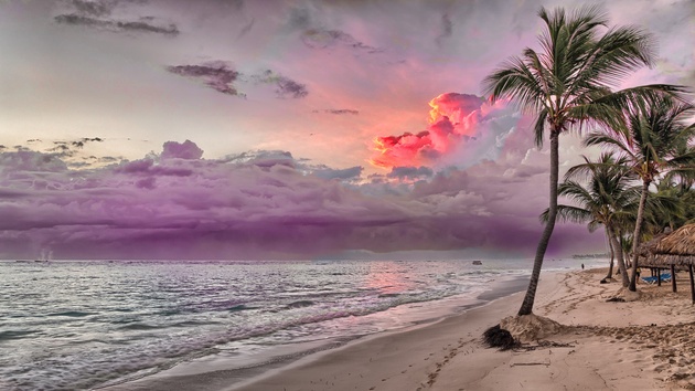
Open the image in Photoshop. On the layer palette we find the list of adjustment layers by clicking the half-filled circle icon. In the list, select "Hue / Saturation" / Hue / Saturation . In the layer settings dialog box, you can change “Hue” / “Hue ” , “Brightness” / Lightness (to make the picture lighter or darker) and “Color Saturation” / Saturation (to make faded or rich colors ). The image can be divided into color channels. Settings allow you to work with all color channels simultaneously or with one. When working with a separate color channel, choosing a specific shade that needs to be changed, use the Eyedropper tool . Click on the icon of the tool, bring to the desired area of ??the photo and make one click. You will see the delimiters on the gradients. On color gradients, you can limit the color range, then changes will occur only in it. By moving the limiters, you set the operating range. Next, moving the sliders for hue, saturation and brightness, it remains to choose the settings according to your task. Give this shot a purple hue to get a more colorful sunset. To do this, select the blue channel. Drag the range stop on the gradient to the right to capture the range of magenta hues. Closer to magenta we shift the Hue / Hue slider , add saturation. Upon completion, close the settings window.The curves
The Curves adjustment layer has more capabilities than we will cover in the basic way for beginners. Open the image, call the Curves adjustment layer from the list of adjustment layers. A settings dialog box opens. Initially, the curve looks straight. We are interested in the Eyedropper tool . There are three of them. The first is responsible for the shadows, the second for the midtones, the third for the light. Now we take the pipettes in turn: first click on the blackest part of the photo, second on the gray, third on the whitest part. With each pipette you will see a change. Curves of the RGB color channels (red, green, blue) will appear on the graph. Upon completion, the curve window can be closed.Levels
For the adjustment layer "Levels" / Levels we will also consider only the basic method of application. The bitmap image, and in this case the image of our photos, consists of dots. These points each have their own color. For saturation, brightness and light, the points of black, gray and white in the image correspond. The adjustment layer "Levels" / Levels allows you to change the level value of the point. Level 0 - black pixels, 255 - white. Level 128 - gray. The remaining levels range between 0 and 255. When redistributing levels, the tonal range of the image changes. For quick color grading, you need to redistribute the midtones. Open the image, in the list of adjustment layers, select "Levels" / Levels . In the settings dialog box, select the middle eyedropper, which is responsible for the midtones. In the image, click on the area where the perfect gray should be. Then close the settings window. Thus, equal values ??of red, green and blue are selected.Color Balance
The name of this adjustment layer speaks for itself. This tool allows you to change colors in shadows, midtones and highlights. Open the image and call the Color Balance adjustment layer . In the dialog box, we will alternately select colors in shadows, midtones and light. Color matching is performed by shifting the sliders on the gradients of individual shades. So you can make green and pink more saturated. As you can see, we moved the slider on the magenta-green gradient towards magenta in midtones and in highlights. So we increased the color saturation. The shade of green was changed by moving the slider towards green in the shadows. Our result: green is closer to what we see with our own eyes in nature; the flowers became richer in color. Using color grading, you can completely change the mood of the picture. Even using these simple examples, boring pictures can be made interesting. Do not stop there. Explore topics deeper. More practice, you will definitely succeed!