
According to the Royal Spanish Academy (RAE), equilibrium is the state of a body when found forces that work in it are compensated by destroying each other . That is, we can ensure that something is balanced when it is compensated , stabilized, matched, is 0, does not fall, or as you want to interpret it . So far, right? Now, how do we translate balance visually ? How do we know if something is balanced in an image? How can we apply it to our compositions? Is it necessary that there is always balance in them or can we play with the imbalance?
VISUAL WEIGHT AND DIRECTIONALITY
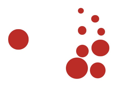
In photography (and who says photography says painting, graphics, audiovisual, advertising, architecture, etc.) we talk about balance through the relationship of the elements that appear in the scene and their visual weight . What is visual weight? The visual weight is the degree of attraction of the element in question, which is determined by the contrast of light that is established between the different elements that compose it. That is, a large star attracts our eyes more than a smaller one, or the red color attracts us more than the blue sky. Also, in all balance, the direction comes into play towards which the elements move, whether this literal or simply a subjective impression.WHAT DOES THE VISUAL WEIGHT OF AN OBJECT DEPEND ON?
We have already advanced a little what characteristics an element must have to have greater or lesser visual weight or level of attraction. Let's take a closer look: Color: According to color theory , colors are divided according to different characteristics, each of which also has the characteristic of having less or greater visual weight than its opposite.- Warm and cold colors: The warm ones have greater visual weight than the cold ones (we also say that they seem to "get closer" more).
- Brightness or luminosity: Dark colors (less brightness) weigh more than light colors (more brightness or brightness).
- Saturation: O degree of color purity (intensity). The more saturation, the greater the visual weight and the lower the saturation, the less weight.
DIRECTIONALITY OF THE ELEMENTS
Not only do we contemplate the visual weight of a scene, but where it is projected, since this directionality of the elements gives us, as well as the weight, greater or lesser impact on the balance of the scene. Shape : The shape of objects projects through their lines , different directions and forces. Thematic : If we recognize the object in question, in many cases we can find out its directionality simply by its shape. For example a face, a plane, a car, and so on. Movement: Beyond the literal movement, we can generate a sensation of movement depending on where we place the weight of the image. Think for example in the law of the gaze in which we leave space in the direction in which the gaze of our protagonist is directed, or in the negative space . Remember also the way we read and how this affects us in the way we perceive the images and, consequently, in the way we compose (the compositions from left to right are more natural to us). Now, so far we have seen that all the elements of the scene have more or less weight, depending on the level of visual attraction they generate, but beyond the weight of the elements in the scene and the directionality, how do we achieve balance in an image?TYPES OF BALANCE IN THE COMPOSITION
Just as a balance is balanced when the weight on both sides of the central axis is the same, we have already commented in the introduction that the balance is based on the compensation of the forces so that the result of them is at 0, compensated or stabilized. There are mainly three ways to compose based on balance: Static or symmetric compositions : They are those that place the visual weights on both sides of the central (imaginary) axis so that both sides attract the view equally, thus expressing calm, balance and rest (and, eye, boredom in some cases ) Dynamic or asymmetric: When we use different visual weights on both sides of the frame, we say that it is asymmetric. The result is dynamic and vital compositions. Compositions in imbalance : If all the weight is placed on one side of the axis, we say that we are faced with an unbalanced or unstable composition in the extreme.CONCLUDING ...
After the infinity of concepts that we leave a few lines above, the most important thing is that you act with instinct . Your gaze knows exactly what weighs more or less, for something we work with our own human perceptions Try to run away from too symmetrical compositions (in mirror) and seek balance in more dynamic compositions. For example, the Rule of thirds is a more dynamic type of composition that is also very balanced, but not only that. The rules are to break them , and the balance can also convey many sensations with imbalanced images: overwhelm, chaos, and so on. I recommend that with a simple sheet of DINA4 paper with a stripe in the middle and a couple of objects of different shapes and colors, you will try different positions of the objects in the plane and see for yourself in a simple way, the weights, the directions and the balance of the elements. Once you are clear, for the real world. In it you will have many more distractions but also much more emotion I hope you have been useful and that you can keep some of the concepts to enrich your images. Oh, and if you think someone could benefit from the article, go ahead, share Thank you and see you soon. Use the free JavaScript formatter browser program to manage and tidy your scripts.