
In this article we are going to see how you can improve your photographs using color. I am going to tell you some basic concepts so that you can situate yourself and understand how it can influence your photography and to what extent. But I promise to explain it to you in the simplest way possible and get to the point.
Now, I assure you that if you use this information when composing your images, you will achieve a change. Color is a powerful tool that you have (and for free) to conquer the viewer's gaze. Stop regretting because you don't have your dream camera or the most desired lens and learn what really matters ? .
Before continuing, I recommend you delve into photographic composition and learn all the essential tips and tricks through this mega guide that we have prepared for you.
WHAT ARE THE PROPERTIES OF COLOR?
Color has its own parameters or properties. The most used in photography are hue, saturation and brightness.
- tone or hue It is actually the quality that gives each color the name by which it is known. That is, we call color what is actually the tone. Blue is a hue, for example.
- Saturation. Saturation is the intensity of a color and its minimum value is a neutral gray, so when we desaturate it in an editor it becomes gray.
- Glow. It is the property that determines if a color is dark or light.
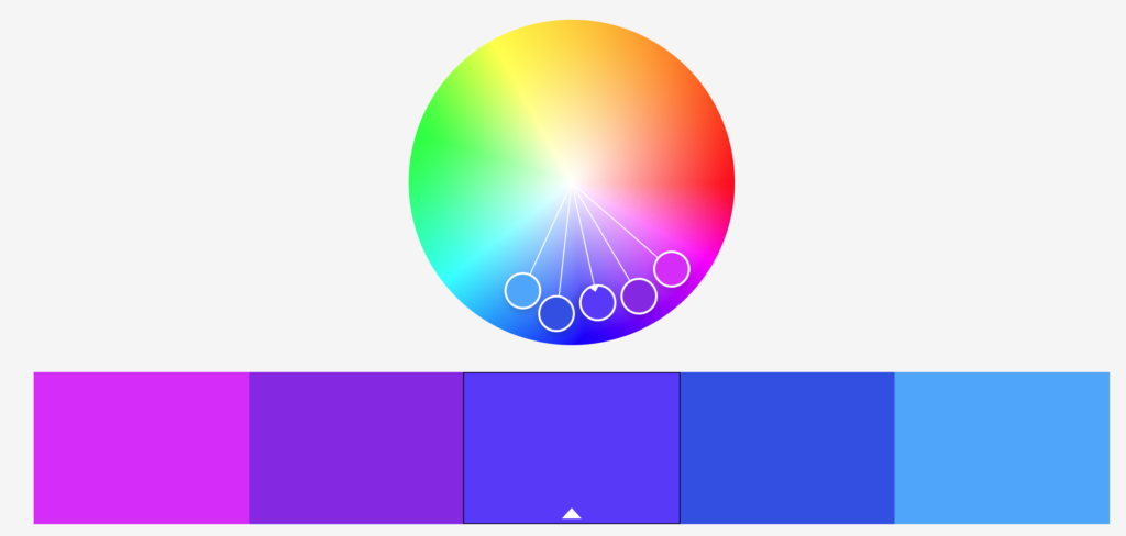
THE COLOR WHEEL
Let's see a brief summary of the chromatic circle, more info in this link .
PRIMARY COLORS
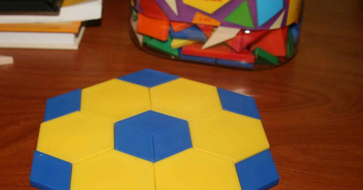
There are three primary colors, which, as you almost certainly know, are yellow, blue, and red. They are the colors that cannot be obtained by mixing any other color.
SECONDARY COLOURS
From the mixture in a 1:1 ratio of the primary colors, the secondary colors (green, orange and violet) emerge.
TERTIARY COLORS
By mixing a primary color with a secondary, a tertiary color (reddish orange, teal, etc.) arises.
COLD AND WARM COLORS, WHAT SHOULD YOU KNOW?
In addition to what you typically learned at school about what cold colors or warm colors were and what they represented, when composing your images you should know that:
- Cool colors zoom out and reduce the size of the elements.
- Warm colors zoom in and increase the size of objects.
HARMONY AND COLOR IN THE COMPOSITION
The way in which colors are combined can cause very different sensations. In photography, we look for harmony in the images and this can come in different ways, either through contrast (complementary colors) or by similarity with analogous colors.
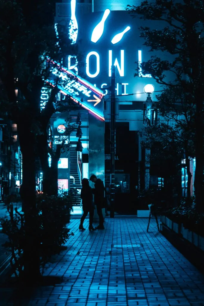
COMPLEMENTARY COLORS
They are those that are in opposite positions on the color wheel, for example: red and green.
The harmony by the complementary colors is based on the contrast and on the effect that it causes, in addition, in reality, the mixture of two opposites in the circle gives rise to a neutral. But keep in mind that using the contrast of complementary in an image works very well.
Now let's look at an image in which two complementary colors are used.
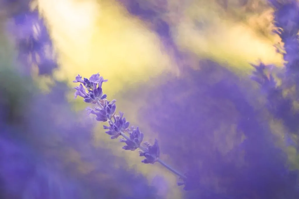
ANALOGOUS COLORS
They are those that are in the same zone of the chromatic circle. The harmony between similar colors is more evident and is very pleasing to the eye.
In the following image you can see an example of what we are talking about.
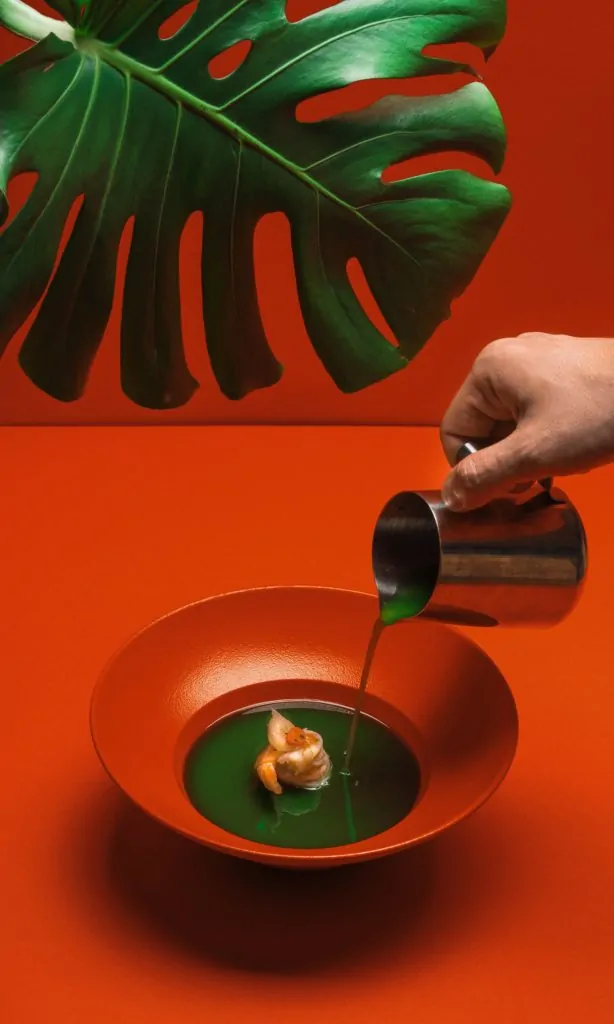
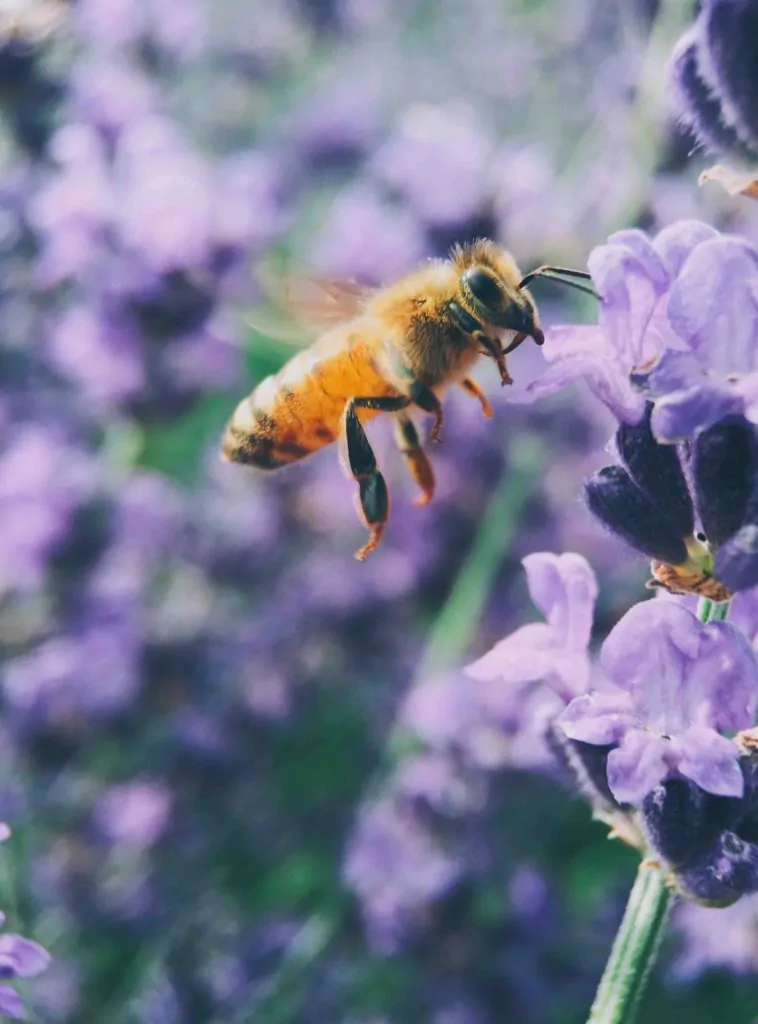
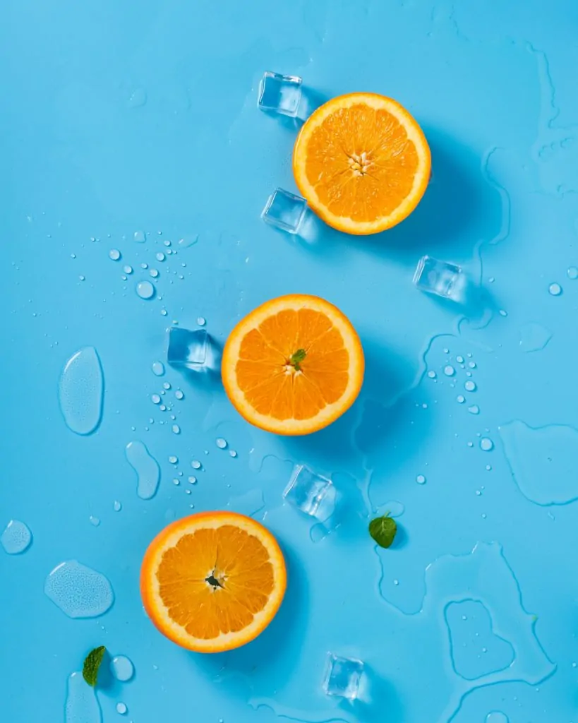
COLOR TRIADS
Another way to achieve a harmonious combination is to choose the colors arranged at the vertices of an equilateral triangle within the color wheel. The ideal is to choose a dominant color, another that supports and a last one that acts as a contrast.
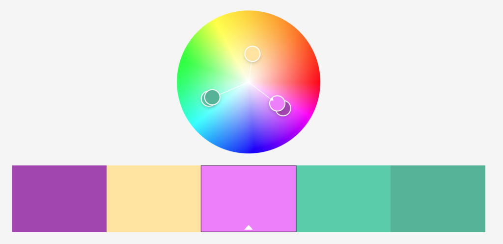
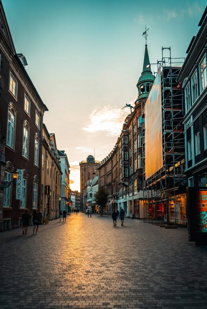
This three-color combination is similar to the one depicted in this photograph. The dominant one would be violet, green as sustenance and golden yellow to contrast.
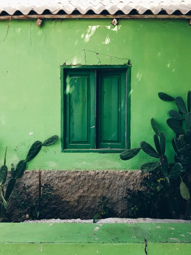
MONOCHROME
Another option that we should not forget is monochrome, which although we associate it with black and white, in reality monochrome is a single color. That is, include in the frame a single color or shade with different tints or shades.
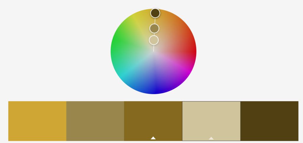
The following image is a good example of monochrome photography.
COLOR PROPORTIONS
Colors harmonize best when there is a balance of weights , that is, when their areas are inversely proportional to their relative brightness. This is, for example, that since green and red are equally bright, they harmonize better when their proportion is 1:1, or what is the same, they have the same presence in the image.
On the other hand, since orange is twice as bright as blue, the ideal ratio should be 1:2 (orange:blue).
Since yellow and purple are at the two extremes of brightness, they work best together in 1:3. Let's see an example.
COLOR PSYCHOLOGY
Each color evokes different emotions and is a resource that you can use to arouse the feeling you want in the public. This is used a lot in the cinema, if you are a movie buff you will have already realized how color can direct a scene or even an entire movie. If you're curious to see what palettes they've used in certain movies, you can check out @CINEMAPALETTES ' posts on Twitter..
Let's see, very briefly, what each color transmits so that you can use it to your advantage when including it in your photography. Because a good composition accompanied by an emotion is a round result.
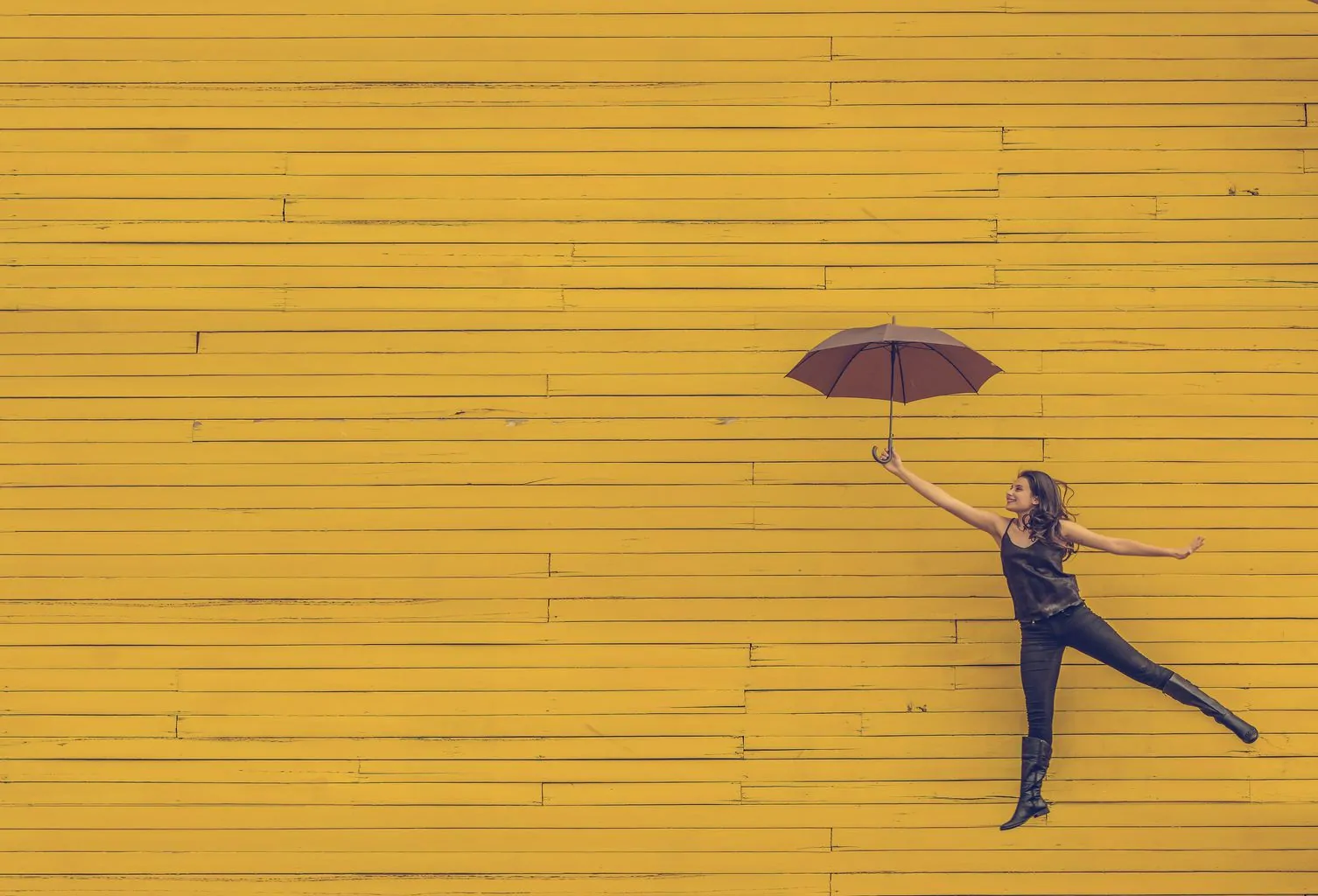
- Yellow: it is so bright that there is no dark version of this color. It transmits verve, joy, optimism and kindness. In its negative part, aggressiveness, jealousy and envy. When combined with black, it contrasts very well, but on the other hand, it indicates a certain sign of danger (it is the combination used to indicate toxic or explosive substances).
- Orange: it is associated with youth, parties, celebrations and fun. It is also suitable for transmitting dryness and evoking heat.
- Red: transmits action and movement, it is the most energetic and exciting color. In the foreground it emphasizes the sensation of depth because it tends to move forward. It evokes passion and also aggression or risk.
- Green: all its positive symbolisms come from the fact that it is the most present color in nature. It is associated with progress and hope, with vigor and rejuvenation, but also in its negative form with illness or decay. If it contains more yellow than blue it is warmer and, vice versa, colder.
- Blue: it is the coldest color and is associated with calm and rest, also with freshness and lightness. It implies distance. If you wear something yellow or red it becomes warmer (remember sunrises and sunsets). It is a color that is associated with security and trust, which is why many health companies use it.
- Violet: the complementary color of yellow is a difficult color to find and very easily confused with purple. It is associated with wealth and sumptuousness, mystery and immensity, while purple is more associated with religions, power and violence.
- White: with white you will be evoking innocence, goodness, love, space, etc...
- Black: evokes elegance and power. On its negative side it is reminiscent of sadness and bad luck, as well as being associated with death.
- Grey: it is a neutral color that is perceived darker or lighter depending on what colors surround it. It evokes indifference and insecurity.
Keep in mind that colors are perceived differently depending on what other colors are nearby. A yellow color will never convey the same thing or be perceived in the same way if it is accompanied by orange as if it is together with black.
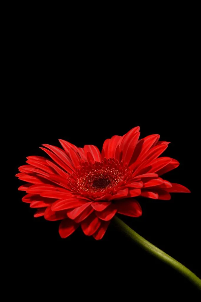
Let's see an example with two red plants, but with different backgrounds, what does one transmit to you and what does the other transmit to you?

LAST NOTES
Now that you know how to create harmony with contrast or with similar colors, etc., in addition to knowing the emotional implications of the different colors, I am going to leave you some more notes so that you can master color in your compositions.
- Color distracts because of its power of communication, so the more colors you include in the frame, the more difficult it will be for you to maintain balance or harmony, and the more they will lose the message. Better include one or two colors, at most three.
- It is very effective to combine a dominant color with its complementary one.
- You can also play with contrast by introducing a warm color into a scene with cold colors, or vice versa.
- Placing a warm color in the foreground is interpreted as proximity.
- Red is a color with a strong appeal, as long as you include it in the frame it will capture a lot of attention.
- To add depth, place a warm color in the foreground, neutrals in the middle, and blue or white in the background.
PRACTICAL EXERCISE
Before saying goodbye, I leave you a series of photographs so that you can observe them and try to find out how they used color when composing them. What do they transmit and what relationship does color have with these sensations?


And here is today's article. I hope you have found it useful and that next time, before composing a photo, you will take color into account. If you liked it, please, do not forget to share it on your favorite social network after giving it a "Like", so we will know what content interests you to continue creating new ones.
