
When photographs you are constantly using contrast, through colors, light, shapes or textures. Because contrast is nothing more than highlighting one element by comparison to another. Every time you do it, whether you are aware or not, you are including the contrast in your images.
WHAT IS THE CONTRAST FOR?
Surely you have heard about the importance of choosing a center of interest in your photographs so that they are not flat or boring, right ?. And the importance of, once you have chosen, guide the viewer through the composition to him. The human eye naturally tends to move towards what stands out in an image. Of a lot of blue balls, in which there is only one yellow, the yellow will stand out by contrast to the rest and therefore our gaze will automatically go there. Thus, we can consider contrast as another compositional tool and it is therefore important that you learn to master it and add it consciously to your images. See how?LEARN TO IDENTIFY THE TYPES OF CONTRAST
To start using something first you have to know a little about the possibilities it offers you and especially where you can find it. Luckily, you have contrast in everything, the most important thing is that it is you who uses it and does not end up in your image just by chance. If you are aware of the contrast, you can take advantage of other compositional elements to complement each other on the way to highlight the center of interest.CONTRAST BY COLOR
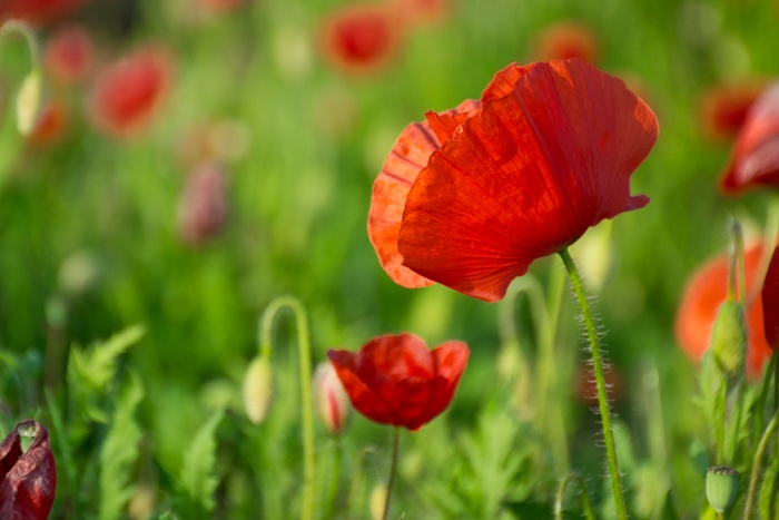
Before we have presented the contrast as the quality of highlighting one element by comparison to another. In color this means knowing and playing with the complementary colors and the harmony of the tones, to achieve greater or lesser contrast. The maximum expression of color contrast occurs between complementary colors , which are those that are opposite in the tonal circle. On the contrary, if you move within a tone and its more immediate nuances, (variations with respect to the same tone) the contrast will be low.- Negative space: You can use the negative space while using color contrast techniques to highlight your main center of interest.
CONTRAST BY SCALE (SIZE)
If we want to highlight a tiny newborn foot, what do we do with it? Exactly, compare it with something much bigger. Look at the next image of the little piece in the hands of an adult. The same image without the contrast of size, would not allow us to get an idea of ??its small size.CONTRAST BY SIGNIFICANCE
This type of contrast is nothing more than opposing very different or opposite situations . For example, a static element next to another in movement, the old and the new, wealth and poverty, and so on. This type of contrast will allow you to add a lot of meaning to your images, even far beyond purely visual contrast.CONTRAST BY LUMINOSITY
Another very interesting way to provide contrast to an image is through the play of light . A point-lit object stands out much more than a homogeneous lighting image where everything has the same amount of light. Playing with this type of image will not only give you visual contrast images, but many times, it will allow you to add deeper meanings associated with the light or the absence of it. There are two extreme techniques in the game of light and contrast with which you can practice and you will not be disappointed. Surely you already know them, right?- High key photography: Those images where light predominates. It is achieved with a white or very clear background and lots of light. They are associated with the positive, the cheerful or the innocence.
- Low key photography: In these, however, darkness predominates; the hidden, the mystery, and even the evil, although at the same time it is strength and elegance. Here you will need a black or very dark background and low light.
CONTRAST BY FORMS
By now you can foresee the explanation, right? Indeed, a contrast by forms is obtained through two or more opposite or different forms. For example, a round within a square, a winding path of the river bed next to a straight highway, the peaks of some mountains and a flat valley ... All this combination of forms we also consider contrast.- Rhythm and break the rhythm: The rhythm is the repetition of one or more elements in a more or less prescribed way. When that pattern is interrupted by an element that interferes in the course of this visual rhythm, we know it as "breaking the rhythm." This type of image is also an image of contrasted forms.
CONTRAST BY TEXTURES
When we talk about textures we usually think of tree barks, wool, rocks, or any element with a clear identifiable texture. However, any element you can photograph has a texture. This may be smoother, thinner or softer, or rougher, but everything has texture. This brings us closer to the image through the memory we have of it, allowing us to feel and imagine the touch of things through the image. That is why we always say that textures are an important element of images, because they allow you to bring the viewer closer to your image and to identify with it through this simple aspect.THE BLACK AND WHITE CONTRAST
Black and white images tolerate high contrast very well, which can range from an image consisting simply of pure white and black as an expression of the highest degree of contrast, to the use of other shades of intermediate gray. The further these shades of gray from pure white or black are, the less contrast we will have in the image. Images of high contrast , are images of greater visual strength and drama, while those of low contrast , are softer images. Depending on the result you want to obtain, you can choose between one or the other. Remember that textures are important, if you overexpose or underexpose you will lose them. Unless you do it with some artistic intention, it is important to expose correctly in order to preserve them.